Khám phá bảng màu son Black Rouge với các sắc thái đa dạng, từ những màu đỏ quyến rũ, cam tươi sáng đến những màu đất cá tính, giúp bạn tự tin tỏa sáng suốt cả ngày. Với chất son mềm mịn, bền màu, Black Rouge là lựa chọn hoàn hảo cho những ai yêu thích sự nổi bật và sang trọng.
1. Son Black Rouge là gì?
Black Rouge là thương hiệu mỹ phẩm Hàn Quốc trực thuộc công ty C&C International, chính thức ra mắt vào năm 2016. Ngay từ những ngày đầu, Black Rouge đã nhanh chóng gây tiếng vang lớn với dòng son kem lì Air Fit Velvet Tint, trở thành một trong những sản phẩm biểu tượng của thương hiệu.
Không chỉ chú trọng vào chất lượng sản phẩm, Black Rouge còn nổi bật với sự đầu tư chỉnh chu vào thiết kế bao bì. Mỗi dòng son của thương hiệu đều mang vẻ ngoài sang trọng, tinh tế và thu hút, chinh phục trái tim phái đẹp ngay từ ánh nhìn đầu tiên. Vậy bảng màu son Black Rouge có bao nhiêu màu? và giá ra sao.
2. Bảng màu son Black Rouge Full Ver
2.1 Mẫu son Black Rouge Air Fit Velvet Tint
Trong bảng màu son Black Rouge, Black Rouge Air Fit Velvet Tint là dòng son chủ lực đã góp phần khẳng định vị thế của thương hiệu trong lòng phái đẹp. Sản phẩm nổi bật với chất son kem lì mềm mượt, mang đến màu sắc chuẩn ngay từ lần sử dụng đầu tiên.

Với thiết kế nhỏ gọn, trọng lượng 4.5g vừa vặn, thỏi son mang lại cảm giác chắc chắn khi cầm, kèm theo đó là nắp vặn tiện lợi và cơ chế chống tràn hiệu quả. Khả năng giữ màu lên đến 8 giờ đồng hồ cũng là một ưu điểm khiến dòng son này được yêu thích rộng rãi.
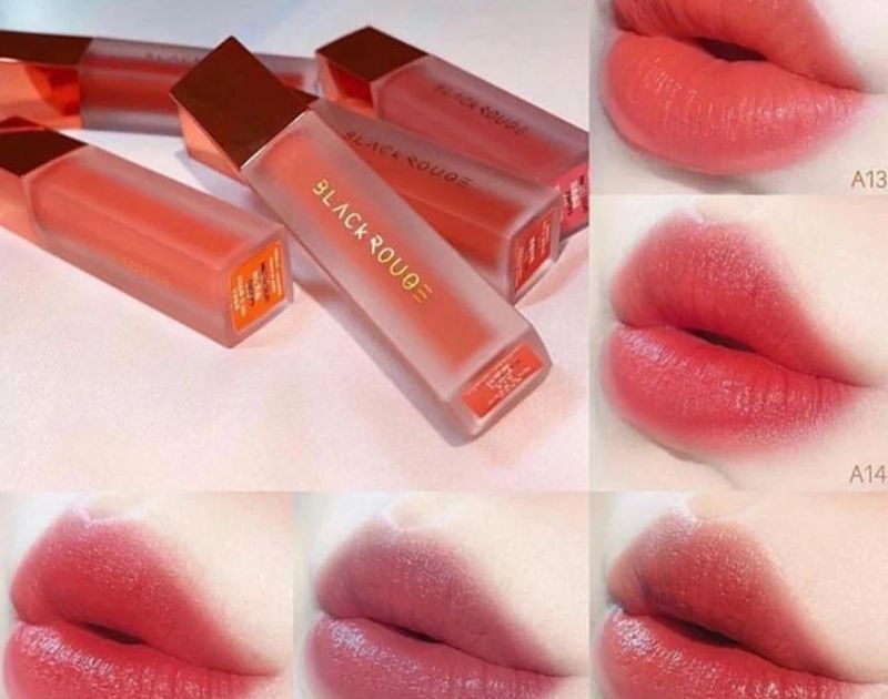
Dòng son Air Fit Velvet Tint sở hữu bảng màu son Black Rouge phong phú với 9 phiên bản và 52 sắc thái khác nhau, bao gồm từ các tông đỏ, cam, hồng rực rỡ đến những màu đất cá tính, đáp ứng mọi phong cách và gu thẩm mỹ hiện đại.
2.2 Màu son Black Rouge Air Fit Velvet Tint Ver 1
Black Rouge Air Fit Velvet Tint Ver 1 là phiên bản đầu tiên của bảng màu son Black Rouge,, được thiết kế với dáng trụ tròn trong suốt, cho phép dễ dàng nhìn thấy màu son bên trong. Bao bì giấy bên ngoài được phủ sắc đỏ rực rỡ, đồng điệu với phần nắp son cũng mang tông đỏ đặc trưng, tạo nên tổng thể nổi bật và cuốn hút.
Ngay khi ra mắt, Ver 1 nhanh chóng chiếm được cảm tình của các tín đồ yêu son nhờ bảng màu trang nhã, tôn lên vẻ đẹp nhẹ nhàng và nữ tính của phái đẹp. Phiên bản này gồm 7 sắc thái ấn tượng:

- A01 – Strawberry Red: Đỏ dâu ngọt ngào
- A02 – Dry Rose: Đỏ cánh hồng khô thanh lịch
- A03 – Soft Red: Đỏ cam trẻ trung
- A04 – Raspberry Syrup: Đỏ trầm quyến rũ
- A05 – Marmalade: Đỏ cam ấm ấn tượng
- A06 – Brick Red: Đỏ gạch thời thượng (sắc son bán chạy nhất của phiên bản này)
- A07 – Pure Crimson: Đỏ cam đào dịu dàng
Sự kết hợp hoàn hảo giữa thiết kế tinh tế và bảng màu thời thượng đã giúp Black Rouge Air Fit Velvet Tint Ver 1 trở thành một màu không thể thiếu bộ sưu tập bảng màu son Black Rouge của những người yêu làm đẹp.
2.3 Mẫu son Black Rouge Cream Matt Rouge
Black Rouge Cream Matt Rouge mang đến thiết kế đầy huyền bí và sang trọng, với tông màu chủ đạo là đen huyền bí, kết hợp cùng các họa tiết vòng tròn lấy cảm hứng từ chiếc vòng dreamcatcher nổi tiếng. Vỏ hộp son được trang trí với nhiều hình ngôi sao tinh tế, tạo điểm nhấn ấn tượng và thu hút ánh nhìn.
Son có thiết kế hình trụ tròn thon dài, với nắp màu đen xám sang trọng. Thân son được làm từ nhựa mờ lì nhám, đồng màu với sắc son bên trong, mang đến cảm giác chắc tay khi sử dụng.

Black Rouge Cream Matt Rouge thuộc bộ sưu tập Season 1 và sở hữu 7 màu sắc quyến rũ trong bảng màu son Black Rouge, mỗi màu đều toát lên vẻ đẹp độc đáo, phù hợp với nhiều phong cách trang điểm khác nhau:
- CM01 – Capella: Đỏ cam tươi mới, rạng rỡ.
- CM02 – Deneb: Đỏ hồng nhẹ nhàng, tinh tế.
- CM03 – Cassiopeia: Đỏ ánh hồng nổi bật, lôi cuốn.
- CM04 – Orion: Đỏ lạnh, mạnh mẽ và cá tính.
- CM05 – Lion: Đỏ nâu đậm, sâu lắng và quyến rũ.
- CM06 – Spica: Đỏ Spica, tươi mới và nổi bật.
- CM07 – Polaris: Đỏ gạch ấm áp, ấn tượng.
Với chất son kem lì mượt mà, Black Rouge Cream Matt Rouge không chỉ mang đến sắc son đầy cuốn hút mà còn bám lâu trên môi, giúp đôi môi bạn luôn mềm mịn, đầy sức sống suốt cả ngày.
2.4 Son Black Rouge All Day Power Proof Matte Tint
Black Rouge All Day Power Proof Matte Tint là dòng son nổi bật với thiết kế độc đáo, thu hút ánh nhìn ngay từ lớp vỏ hình trụ tam giác cá tính, bao phủ bởi sắc coral rực rỡ, tràn đầy sức sống. Điểm nhấn ấn tượng là lớp phủ hologram lấp lánh, thời thượng, tạo nên vẻ sang trọng và cuốn hút.
Bên trong, thân son hình trụ tròn thon dài, nắp son đồng màu coral mang lại tổng thể hài hòa và bắt mắt. Chất liệu nhựa trong mờ lì nhám để lộ màu son bên trong, kết hợp với đầu cọ vát xéo thông minh có lỗ khoét giúp điều chỉnh lượng son, đảm bảo thao tác dễ dàng và lớp son hoàn hảo.

Sản phẩm ứng dụng công nghệ Slim Fit, mang đến lớp son lì mịn, bám màu suốt cả ngày, bất chấp mọi hoạt động. Chất son lỏng nhẹ, dễ tán, tạo hiệu ứng finish mỏng nhẹ như không và cho phép bạn thực hiện phong cách ombre thời thượng chỉ trong vài thao tác.
Điểm nổi bật nhất của All Day Power Proof Matte Tint chính là khả năng chống trôi vượt trội. Kể cả khi bơi lội hay tham gia các hoạt động ngoài trời, lớp son vẫn bền màu, giữ cho đôi môi luôn rạng rỡ, giúp bạn tự tin suốt ngày dài.
Đây là 1 trong bộ sưu tập bảng màu son Black Rouge, mang đến những tông màu năng động, hoàn hảo cho mùa hè:
- MT01 – Beach Ball Red: Đỏ thuần trung tính
- MT02 – Sunny Orange: Cam sáng pha đỏ rực rỡ
- MT03 – Tanning Coral: Cam ánh đỏ nổi bật
- MT04 – Hipster Chili: Đỏ nâu cam thời thượng
Với mức giá phải chăng, dao động khoảng 195.000 VNĐ/thỏi tùy theo địa điểm, Black Rouge All Day Power Proof Matte Tint là sự lựa chọn lý tưởng, đáp ứng cả tiêu chí chất lượng và kinh tế cho mọi tín đồ làm đẹp.
2.5 Son Black Rouge Color Lock Heart Tint
Black Rouge Color Lock Heart Tint mang đến một diện mạo hoàn toàn mới, khác biệt so với các dòng son trước đó. Thiết kế hình trái tim độc đáo và ấn tượng, kết hợp với bao bì giấy màu hồng phấn điểm xuyết họa tiết trái tim ngọt ngào cùng hiệu ứng hologram thời thượng, tạo nên vẻ ngoài vừa đáng yêu vừa sành điệu. Thân son trong suốt với hiệu ứng gradient, giúp dễ dàng nhận diện màu son bên trong. Đầu cọ được thiết kế hình chiếc lá với độ nghiêng nhẹ và lỗ khoét thông minh, hỗ trợ điều chỉnh lượng son chính xác, mang lại trải nghiệm sử dụng tiện lợi. Đây được xem là một trong những màu được săn đón nhất trong bảng màu son Black Rouge.

Về chất son, Black Rouge Color Lock Heart Tint kế thừa sự mịn màng của dòng Air Fit, nhưng có kết cấu đặc hơn một chút. Công nghệ Color Lock giúp màu sắc đồng đều, chất son xốp mềm, không gây vón cục và mang đến cảm giác thoải mái khi sử dụng. Sản phẩm có khả năng bám màu lâu từ 4-7 tiếng, khi phai để lại lớp satin nhẹ nhàng, duy trì vẻ tươi tắn cho đôi môi.
Bảng màu son Black Rouge Color Lock Heart Tint của dòng son này gồm 5 gam màu thời thượng, phù hợp với nhiều phong cách khác nhau:
- H01 – Cheese Carrot: Cam sữa tươi sáng
- H02 – Adorable Rose: Hồng ngọt ngào nữ tính
- H03 – Neon Pomelo: Cam đào rạng rỡ
- H04 – Almond Berry: Hồng dâu quyến rũ
- H05 – Provocative Cherry: Cherry đỏ nâu sang trọng
Với mức giá hợp lý, dao động khoảng 200.000 VNĐ/thỏi (tùy thuộc vào từng địa điểm), Black Rouge Color Lock Heart Tint là lựa chọn lý tưởng cho những ai yêu thích thiết kế độc đáo và chất son vượt trội.
2.6 Son Black Rouge Rose Velvet
Black Rouge Rose Velvet Lipstick là sự kết hợp giữa sự quyến rũ và nét ngọt ngào, lấy cảm hứng từ vẻ đẹp lôi cuốn của những đóa hồng kiêu sa. Dòng son này không chỉ là phụ kiện làm đẹp mà còn là tuyên ngôn cho phong cách thanh lịch, hiện đại.
Với thiết kế thỏi son hình trụ mảnh mai, lớp vỏ hồng nude thanh thoát cùng phần ruột kim loại chắc chắn, Black Rouge Rose Velvet tạo nên vẻ ngoài sang trọng khó cưỡng. Điểm nhấn độc đáo nằm ở chi tiết số hiệu màu son được khéo léo in trên vỏ kim loại, không chỉ giúp phân biệt màu sắc mà còn tăng thêm dấu ấn cá nhân cho từng thỏi son.

Chất son là một trải nghiệm khác biệt: mịn màng như nhung, nhẹ nhàng như cánh hồng. Son lướt trên môi êm ái, lên màu chuẩn xác chỉ trong một lần chạm. Công thức giàu dưỡng chất không chỉ giữ đôi môi mềm mại cả ngày mà còn mang lại cảm giác thoải mái, không hề bết dính hay nặng nề. Đây chính là dòng son lý tưởng cho những ai muốn duy trì vẻ đẹp rạng rỡ mà không cần lo lắng về độ bền màu.
Trong bảng màu son Black Rouge thì Black Rouge Rose Velvet gồm 5 sắc thái tinh tế, từ ngọt ngào đến cá tính:
- R01 – Lady Rose: Đỏ cherry cổ điển, đầy sức sống.
- R02 – Sunshine Rose: Đỏ chili rực rỡ, phù hợp cho những buổi dạo chơi năng động.
- R03 – Latte Rose: Cam đào dịu dàng, hoàn hảo cho vẻ đẹp tự nhiên.
- R04 – Burgundy Rose: Đỏ rượu huyền bí, lý tưởng cho những buổi tối sang trọng.
- R05 – Wild Rose: Hồng đất hiện đại, biểu tượng của sự thời thượng.
Với mức giá dao động từ 170.000 VNĐ đến 250.000 VNĐ, Black Rouge Rose Velvet không chỉ là lựa chọn làm đẹp, mà còn là món quà hoàn hảo dành cho chính bạn hoặc những người yêu thương.
2.7 Son Black Rouge Mousse Blending
Black Rouge Mousse Blending là minh chứng hoàn hảo cho sự sáng tạo và ngọt ngào, lấy cảm hứng từ những chiếc kẹo bông gòn mềm mại, thơm ngọt. Bộ sưu tập này nổi bật với thiết kế tinh tế, mang sắc hồng ombre chủ đạo trải dài từ nắp đến đáy son, không chỉ tạo nên vẻ đẹp độc đáo mà còn giúp bạn dễ dàng nhận biết màu sắc bên trong.
Điểm nhấn đặc biệt nằm ở logo thương hiệu Black Rouge được in chìm hologram chạy dọc thân son, tạo hiệu ứng lấp lánh cuốn hút. Đầu cọ vát chéo được thiết kế cùng mút bông mềm mại, hỗ trợ việc thoa son chính xác, dễ dàng tạo nên đôi môi hoàn hảo. Bao bì được chăm chút tỉ mỉ, từ tông màu ombre hồng nhẹ nhàng đến thông tin sản phẩm rõ ràng, mang đến trải nghiệm tinh tế cho người dùng.

Về chất son, Mousse Blending đúng như tên gọi, sở hữu kết cấu bông xốp nhẹ nhàng, mềm mịn như nhung. Son lướt nhẹ trên môi, dễ dàng tán đều và tạo lớp finish mịn lì mà không gây bột hay cảm giác nặng môi. Khả năng giữ màu cũng là một điểm mạnh, với độ bám lên đến 8 tiếng, giúp đôi môi rạng rỡ suốt cả ngày mà không lo lộ vân môi hay xuống tông.
Bảng màu son Black Rouge Mousse Blending mang đến những sắc thái thời thượng:
- S01 – Rosy Cinnamon: Hồng đào ngọt ngào, lý tưởng cho phong cách dịu dàng.
- S02 – Sweet Tangerine: Đỏ cam rực rỡ, tràn đầy năng lượng.
- S03 – Classic Beige: Cam đất pha đỏ thời thượng, phù hợp với mọi tông da.
- S04 – Cherry Berry: Hồng tím quyến rũ, tạo điểm nhấn độc đáo.
- S05 – Milky Latte: Đỏ nâu thanh lịch, hoàn hảo cho vẻ đẹp cá tính.
Với mức giá dao động từ 180.000 – 210.000 VNĐ, Black Rouge Mousse Blending là sự lựa chọn tuyệt vời, mang đến sự kết hợp hoàn hảo giữa chất lượng vượt trội và thiết kế đẳng cấp. Thỏi son này không chỉ là một sản phẩm làm đẹp mà còn là món quà lý tưởng dành cho chính bạn hoặc người thân yêu.
2.8 Son Black Rouge Air Fit Chok Chok
Black Rouge Air Fit Chok Chok Tint mang đến sự đột phá trong thiết kế và chất lượng, trở thành lựa chọn hoàn hảo cho những cô nàng yêu thích sự sang trọng, tinh tế. Bộ sưu tập nổi bật với diện mạo cuốn hút: vỏ son được làm từ giấy cứng màu đỏ rực rỡ, kết hợp cùng nắp son ánh gương đỏ hồng lấp lánh, tạo nên một tổng thể vừa thanh lịch vừa thời thượng.
Thân son có dạng trụ vuông trong suốt, đi kèm hiệu ứng hologram độc đáo, giúp dễ dàng quan sát màu son bên trong. Điểm nhấn thiết kế nằm ở đầu cọ hình giọt nước với lỗ thông khí nhỏ, giúp điều tiết lượng son một cách chính xác, đảm bảo lớp son được tán đều và không bị lem. So với dòng Air Fit Velvet Tint trước đó, Air Fit Chok Chok Tint sở hữu phần nắp son tráng gương, tạo nên sự trẻ trung và hiện đại hơn.

Chất son là sự hòa quyện độc đáo giữa tint bóng và tint lì, mang đến trải nghiệm mới lạ. Khi thoa, son để lại lớp bóng nhẹ, sau đó chuyển dần sang lớp finish lì mịn tự nhiên, giúp đôi môi rạng rỡ và mềm mại. Chất son xốp đặc, dễ dàng tán đều, không gây bết dính hay khô môi. Đặc biệt, độ bền màu lên đến 6 tiếng, đảm bảo đôi môi luôn tươi tắn cả ngày. Chỉ với một lần lướt nhẹ, son đã lên màu chuẩn, giúp bạn nhanh chóng sở hữu diện mạo quyến rũ.
Trong bảng màu son Black Rouge, thì Air Fit Chok Chok Tint thiên về sắc đỏ rực rỡ, phù hợp với nhiều phong cách và tông da:
- C01 – Blown Tulip: Đỏ hồng ngọt ngào, trẻ trung.
- C02 – Shy Grapefruit: Đỏ cam rực rỡ, tràn đầy năng lượng.
- C03 – Pomegranate: Đỏ lựu quyến rũ, cá tính.
- C04 – Black Tea: Đỏ trà trầm ấm, thanh lịch.
- C05 – Lilac Flower: Hồng đỏ trầm dịu dàng, đầy cuốn hút.
- C06 – Cherry: Đỏ cherry tươi sáng, ngọt ngào.
- C07 – Devious: Đỏ hồng sắc sảo, nổi bật.
Với mức giá vô cùng hợp lý, chỉ từ 165.000 đồng, bạn đã có thể sở hữu ngay một thỏi Black Rouge Air Fit Chok Chok Tint, sản phẩm vừa đẹp mắt vừa chất lượng, hứa hẹn sẽ làm hài lòng mọi tín đồ làm đẹp.
2.9 Son Black Rouge Leez Velvet Tint
Black Rouge Leez Velvet Tint tiếp tục kế thừa và phát huy sự thành công của các dòng son trước đó trong các màu ở bảng màu son Black Rouge, với sự đầu tư tỉ mỉ từ thiết kế bao bì đến chất lượng sản phẩm.
Với vỏ giấy đơn sắc tinh giản nhưng đầy sang trọng, Black Rouge Leez Velvet Tint nổi bật với tên sản phẩm được in nổi bật cùng phần nắp trong suốt, giúp người dùng dễ dàng nhận diện màu sắc son bên trong. Đặc biệt, dòng son này còn tích hợp QR code “Lip ID” trên vỏ hộp, giúp bạn nhanh chóng kiểm tra thông tin về sản phẩm và màu sắc thực tế chỉ với một lần quét.

Thân son thon dài, được làm từ chất liệu nhựa nhám cao cấp, không chỉ mang lại cảm giác chắc chắn khi cầm mà còn giúp bạn dễ dàng theo dõi lượng son còn lại. Đầu cọ được thiết kế bo tròn, với lớp lông dày mềm mịn, giúp việc lấy và thoa son đều màu trở nên dễ dàng và chính xác.
Black Rouge Leez Velvet Tint sở hữu chất son kem lì mịn màng, với độ xốp nhẹ đặc trưng. Khi thoa lên môi, son mang đến cảm giác ẩm mượt ngay lập tức, sau đó chuyển dần sang lớp finish lì mịn màng, không gây cảm giác khô môi hay lộ vân môi. Sản phẩm mang lại sự thoải mái suốt cả ngày dài, với độ bám màu ấn tượng mà không lo lắng về việc phải dặm lại son.
Dưới đây là bảng màu son Black Rouge Black Rouge Leez Velvet Tint:
- LZ01 – Peach Papaya: Đỏ cam tươi mới, mang đến vẻ ngoài năng động.
- LZ02 – Apple Greek Yogurt: Hồng trà sữa nhẹ nhàng, thanh thoát.
- LZ03 – Mango Coconut: Cam cháy ấm áp, đầy quyến rũ.
- LZ04 – Raspberry Milk: Đỏ đất ánh cam, mạnh mẽ và cá tính.
- LZ05 – Two Shot Peanut Latte: Nâu đỏ đất, dịu dàng nhưng đầy sang trọng.
Với mức giá chỉ từ 160.000 đồng cho mỗi cây son, Black Rouge Leez Velvet Tint là lựa chọn tuyệt vời cho những tín đồ làm đẹp yêu thích sự sang trọng, tiện lợi và chất lượng vượt trội. Bạn cũng có thể tham khảo thêm các màu khác trong bảng màu son Black Rouge.
2.10 Son Black Rouge Cotton Lip Color
Black Rouge Cotton Lip Color ra mắt vào năm 2018, bộ sưu tập này được lấy cảm hứng từ mùa thu, mang đến cho các tín đồ làm đẹp một lựa chọn hoàn hảo với sắc son ấm áp và quyến rũ.
Dòng son này sở hữu thiết kế tối giản nhưng vô cùng tinh tế. Vỏ hộp màu đỏ nổi bật, in rõ logo và tên màu son, tạo sự dễ dàng nhận diện. Thân son hình trụ tròn nhỏ gọn, được làm từ chất liệu nhựa mờ nhám, mang lại cảm giác cầm nắm chắc tay. Điểm nhấn đáng chú ý là logo Black Rouge màu bạc, chạy dọc theo thân son, cùng phần nắp son được thiết kế đồng màu với sắc son bên trong, giúp bạn dễ dàng lựa chọn màu sắc yêu thích.

Về chất son, Black Rouge Cotton Lip Color là son kem lì với thành phần chiết xuất thiên nhiên. Chất son mousse mịn màng, lướt nhẹ trên môi, dễ dàng tán đều mà không gây vón cục. Lớp finish lì mịn như nhung, giữ được độ ẩm tự nhiên, che phủ hoàn hảo khuyết điểm mà không làm môi khô hay lộ vân, mang đến cho đôi môi vẻ căng mọng, mềm mại và quyến rũ.
Bảng màu son Black Rouge Cotton Lip Color gồm 8 tông màu MLBB trendy, được yêu thích bởi nhiều chị em:
- T01 – Choco Red: Đỏ nâu ấm áp, thời thượng.
- T02 – Vintage Lady: Đỏ hồng đất, cổ điển và quyến rũ.
- T03 – Sweet Pumpkin: Đỏ cam cháy, nổi bật và tươi mới.
- T04 – Tomato Box: Đỏ san hô, nhẹ nhàng nhưng đầy cuốn hút.
- T05 – Rose Macaron: Đỏ cánh hồng khô, dịu dàng và tinh tế.
- T06 – Orange Pop: Cam đỏ đất, mạnh mẽ và cá tính.
- T07 – Rosie Rouge: Hồng tím, tươi mới và lãng mạn.
- T08 – Hot Mocha: Nâu đỏ trầm, thanh lịch và quyến rũ.
Với mức giá chỉ khoảng 195.000 đồng cho mỗi cây son, Black Rouge Cotton Lip Color là sự lựa chọn lý tưởng cho những ai yêu thích son lì chất lượng với giá cả phải chăng. Đừng bỏ lỡ cơ hội sở hữu một thỏi son đẹp, bền màu và dưỡng ẩm tuyệt vời từ bộ sưu tập trong bảng màu son Black Rouge.
3. Hướng dẫn son Black Rouge đúng cách
Để có đôi môi quyến rũ và hoàn hảo, ngoài việc chọn màu son trong bảng màu son Black Rouge, bạn cũng cần nắm vững kỹ thuật thoa son để đạt được hiệu quả tốt nhất:
Thoa son lòng môi
- Chọn màu son yêu thích và dùng cọ, tay hoặc thoa trực tiếp son lên phần giữa lòng môi dưới.
- Mím môi và tán đều son ra phía ngoài cho đến khi tạo được hiệu ứng màu sắc đậm dần từ lòng môi.
- Lưu ý chỉ sử dụng một lượng son vừa phải để tránh tình trạng lem son.
- Bạn có thể sử dụng kem che khuyết điểm để tạo đường viền môi sắc nét và làm nổi bật dáng môi theo ý muốn.
Thoa son cả môi
- Bắt đầu thoa son từ lòng môi dưới, sau đó tán đều ra các góc môi, rồi tiếp tục thoa lên môi trên.
- Dùng đầu nhọn của thỏi son để viền môi, tạo độ sắc nét cho đường viền.
- Thoa thêm một lớp son nếu cần thiết để màu sắc trở nên chuẩn và chính xác hơn.
Xem thêm:
Xanh bơ hợp với da nào? Outfit sành điệu gam màu xanh bơ
Màu be hợp với màu gì? 5 sai lầm dễ gặp khi phối màu be
Với những bước thoa son đúng cách, đôi môi của bạn sẽ luôn mềm mại, quyến rũ và nổi bật.
Dù bạn là tín đồ yêu thích sắc đỏ quyến rũ hay những gam màu nhẹ nhàng, tự nhiên, bảng màu son Black Rouge sẽ luôn đồng hành cùng bạn trong mọi phong cách và dịp lễ. Hãy để đôi môi bạn trở thành điểm nhấn hoàn hảo, tỏa sáng rực rỡ và thể hiện cá tính riêng biệt. Chọn Black Rouge, chọn sự hoàn hảo cho vẻ đẹp của bạn!
Win777 Casino has a decent selection of slots and live games. I’ve had some luck there, but remember to play responsibly! Just another option to consider. Check them out at: win777casino
Helo88Discount? Alright I’m intrigued. Gotta love a discount code while I’m playing. Worth checking out? You can see about helo88discount. Good luck!
Hey everyone! Been playing around on luckycalicoactivity for a bit. Seems legit, good selection of games. Fingers crossed for some wins! Give it a whirl, might be your lucky day: luckycalicoactivity.
Juanbingo, not the flashiest site, but you can’t go wrong with a good bingo game. Always decent prizes. Time to try juanbingo.
tg77com https://www.tg77com.org
nustaronline https://www.umnustaronline.org
phtaya06 https://www.phtaya06y.com
phtaya10 https://www.phtaya10y.com
fb777login https://www.fb777loginv.org
taya777login https://www.wtaya777login.com
2222ph https://www.be2222ph.org
bk8casino https://www.bk8casinovs.com
luckybet https://www.aluckybet.net
pin up игровые автоматы вход пин ап
промокод алиэкспресс на сегодня рабочий промокод aliexpress
pin up casino online https://school7-kirishi.ru
смотреть хорошее кино фильмы топ
Volvo в Україні https://telegra.ph/Kupit-spectehniku-Volvo-03-30 екскаватори, фронтальні навантажувачі та дорожні машини. Надійність, ефективність і сучасні рішення для будівництва. Продаж, підбір і обслуговування техніки для бізнесу.
Нужны заклепки? заклепка вытяжная цена прочный крепеж для соединения деталей. Алюминиевые, стальные и нержавеющие варианты. Надежность, долговечность и удобство монтажа для различных задач и конструкций.
new york city office personal office space for rent
услуги ответственного хранения https://otvetstvennoe-hranenie-sklad.ru
услуги ответственного хранения https://otvetstvennoe-hranenie-sklad.ru
шумоизоляция автомобиля https://shumoizolyaciya-avtomobilya-1.ru
дизайн проект интерьера дизайн интерьера квартиры недорого
ремонт мембранной кровли https://remont-membrannoj-krovli-1.ru
шумоизоляция автомобиля Москва https://shumoizolyaciya-avtomobilya-moskva-1.ru
шумоизоляция автомобиля цена https://shumoizolyaciya-avtomobilya-cena-1.ru
Лучшее путешествие джип туры цена горы, каньоны и побережье. Увлекательные маршруты, опытные гиды и яркие впечатления от путешествий по Крыму.
Do you trade cryptocurrencies? best place for crypto trading automate your transactions and earn passive income. Smart algorithms analyze the market and help you make decisions. Increase your income and reduce risks with modern technology.
Do you trade cryptocurrencies? best ai trading tool bitkelttrade automate your transactions and earn passive income. Smart algorithms analyze the market and help you make decisions. Increase your income and reduce risks with modern technology.
https://telegramushka.ru/forum/topic/vakuumirovanie-holodilnyh-sistem/ mirnov.ru
[url=https://che.best-city.ru/forum/thread101327/#reply101346]инструкция[/url]
печать флагов на заказ заказ флагов с логотипом спб
Хочешь оригинальную подушку? заказать подушку дакимакура комфорт и уют для сна. Длинная форма, мягкий наполнитель и стильные принты. Отлично подходит для отдыха и расслабления.
Нужен пластический хирург? https://plasticheskaya-hirurgiya-klinika.ru современные операции и эстетические процедуры. Опытные хирурги, безопасные методики и индивидуальный подход. Консультации, диагностика и качественный результат.
Нужна мебель? мебель из массива цена эксклюзивные изделия из натурального дерева. Индивидуальный дизайн, качественные материалы и точное изготовление. Решения для дома и бизнеса.
Нужна премиум мебель? https://premialnaya-mebel.ru изготовление на заказ. Натуральные материалы, эксклюзивный дизайн и долговечность. Решения для дома и бизнеса с высоким уровнем качества.
Hello to every single one, it’s truly a nice for me to pay a quick visit this web page, it includes important Information.
05161
89fgamedownload! I’m always looking for new game downloads, gonna see if this is legit. Will post a review later. Check the site here 89fgamedownload
I will reccomend bet333login to anyone that needs an app to let loose a bit, and try your luck. It never hurts to try it out bet333login! Join on up!
Alright guys, just tried out leaobetslot and gotta say, it’s pretty solid! The slots are fun and the site runs smoothly. Definitely worth checking out if you’re looking for a new spot to spin those reels. Check it out here! leaobetslot
мебель премиум сегмента мебель из массива каталог цены
Обязательно к прочтению: https://albinagoncharova.ru
[url=https://dubai-villas-sale.com]off plan villa for sale dubai[/url]
Howdy! I know this is kinda off topic however I’d figured I’d ask. Would you be interested in exchanging links or maybe guest authoring a blog article or vice-versa? My blog addresses a lot of the same topics as yours and I believe we could greatly benefit from each other. If you are interested feel free to shoot me an email. I look forward to hearing from you! Awesome blog by the way!
https://share.google/gD7FW8ksTs5naNSXh
What a data of un-ambiguity and preserveness of valuable familiarity concerning unexpected feelings.
https://share.google/gyJ8o9LqekNrBn5Nm
Полное руководство на https://npprteam.shop/articles/facebook/facebook-ads-cpa-target-cpa-strategiya-stavok/ содержит актуальную информацию о ставочных стратегиях Facebook Ads, проверенную практикой медиабайеров в 2025-2026 годах. Документация включает примеры расчётов целевой стоимости действия для разных вертикалей бизнеса, таблицы сравнения производительности при разных подходах и чек-листы для аудита существующих кампаний. Контент ориентирован на специалистов с базовым опытом работы с Facebook Ads, готовых к переходу на продвинутый уровень управления ставками и бюджетным планированием. Материал постоянно обновляется в соответствии с изменениями платформы, что гарантирует актуальность информации и её применимость к текущему состоянию алгоритмов Facebook. Добавьте этот ресурс в закладки, чтобы всегда иметь под рукой проверенные методики оптимизации CPA и базовые принципы Target CPA для вашего следующего проекта.
Изучение Google Discovery Ads стратегия для арбитража трафика открывает новые возможности для масштабирования объемов с минимальными издержками. В современной медиабайинговой практике Discovery Ads занимают ключевую нишу между поисковой и медийной рекламой, позволяя достичь высоконасыщенной аудитории потенциальных конвертеров. Платформа Google автоматически размещает объявления на YouTube, Gmail и в сервисах партнеров, используя передовые алгоритмы машинного обучения для определения целевых групп по поведению и интересам. Специалисты по трафик-арбитражу получают доступ к инструментам таргетирования по демографии, ремаркетингу и пользовательским аудиториям без необходимости вручную управлять плейсментами. Этот подход позволяет оптимизировать ROAS и снижать стоимость привлечения конверсии на 30–50 процентов в зависимости от вертикали и корректной настройки кампаний.
What’s up everybody, here every person is sharing these kinds of familiarity, thus it’s pleasant to read this weblog, and I used to pay a visit this website all the time.
https://share.google/Ix9fpoN4XTQuiRlHw
While browsing through different articles and creative ideas, I noticed something that stood out in the middle view this page and it seems to carry a refreshing tone that keeps the reader interested
Current recommendations: https://sarapang.com
During a casual exploration of informational websites, I came across something placed in the middle open this page and it seems to be a valuable resource that offers useful insights for many people
During review of wildlife sustainability resources and ecological conservation initiatives, I encountered content containing protected swan species project hub integrated within environmental awareness discussions – this demonstrates efforts to safeguard mute swans while promoting long-term habitat protection and encouraging global understanding of biodiversity conservation priorities and ecosystem stability
While browsing for something different, this entertainment site – It brings a smile right away thanks to its playful energy and genuinely amusing approach to everyday topics.
phiferforcongress – Political campaign website shares candidate vision and policies community focus
The material found on this progress‑focused site – Addresses meaningful topics with a level of care and detail that shows genuine dedication, making it a worthwhile stop for thoughtful readers.
While exploring jewelry brand portfolios and handmade accessory shops, I encountered content featuring exclusive handmade jewelry collection integrated within product pages – it focuses on offering one-of-a-kind jewelry pieces designed with artistic craftsmanship, providing customers with meaningful accessories that reflect creativity and cultural storytelling
While exploring different options online, this cleanly organized platform – Kept me engaged longer than expected simply because navigating felt intuitive and free of annoying obstacles.
For anyone researching healthcare options online, this professional medical site – Offers a very clean reading experience, with well‑organized sections that make complex information feel simple and approachable.
From a party planning perspective, this holiday event website – Does a fantastic job of building excitement while keeping everything neatly arranged, which is exactly what you want for seasonal gatherings.
While browsing through various informational and history-themed websites today, I came across something naturally embedded in the content flow, check this archive site, and it turned out to be quite an interesting website where I found several helpful details while exploring different pages
I recently explored several online shopping platforms for comparison purposes and during that research I discovered simple food marketplace portal which stood out among others because of its layout and usability – the platform appears clean and intuitive, offering users a surprisingly smooth browsing journey overall experience
During a casual browsing session, something caught my attention while I was looking through multiple pages, have a look, and it seems like a fun and engaging site that could be worth checking out in more detail
In comparisons of modern shopping platforms focused on usability and visual clarity, a strong example is Grove Boutique Opal Hall which maintains simple interface and content feels neatly arranged throughout the pages, providing a balanced and distraction free browsing experience for users.
During a long session of exploring travel destination websites and guides, I noticed something appearing in the middle of the content, check this destination page, and it is a nice website where everything is easy to find and understand quickly with clear navigation
While exploring high performance web pages, I encountered explore smooth loading hub – The site has a clean interface, fast loading speeds, and smooth functionality that makes browsing feel effortless and well optimized.
mitchwantssununu.com – Interesting concept site, content feels direct and somewhat thought provoking today
Users who appreciate traditional styled ecommerce platforms often browse sites such as Wheatfield Cove Outpost Store where navigation is clear and uncluttered – The rustic theme creates a welcoming atmosphere, helping users easily find products while enjoying a calm and visually consistent shopping experience.
During my search for eco-energy solutions online, I noticed check this green fuel page – The resource is quite informative, and I learned something new just from casually reading through the sections available.
During my comparison of event websites, I encountered follow this winter link – The site offers a refreshing layout with useful content that is simple to navigate and enjoyable to explore without unnecessary complexity.
People who appreciate structured shopping websites often browse platforms like Sun Cove Organized Goods District where items are displayed in a clean and intuitive format – The interface makes browsing feel simple, efficient, and enjoyable with clear organization across all product sections.
Across various digital storefront evaluations emphasizing usability and flow, a notable example is Glade Frost Vendor Vault which delivers feels structured and simple, making it easy to explore content, ensuring users experience a clean interface with intuitive navigation across all pages.
As I moved through different civic and nonprofit platforms, I found something in between the content, explore coalition page, and the site is informative with strong focus on community goals and coordinated initiatives overall
Users who appreciate practical online marketplaces often browse sites such as Kettle Harbor Commerce Network Hub where products are presented in a structured layout – The interface creates a browsing experience that feels organized, easy, and easy to follow throughout the store.
While browsing curated Hawaii lodging collections and boutique stays, I recently discovered a beautifully presented property showcase that stood out significantly < holualoa retreat overview – The presentation feels calm and inviting, offering a relaxing overview that highlights comfort, scenery, and thoughtful hospitality details overall
While exploring online thought leadership style pages I found a minimalist website presenting political and social commentary through raw perspective hub – the tone is consistently direct and leaves space for readers to interpret meaning based on their own understanding and context
While browsing alternative energy and sustainable fuel websites, I came across visit this biodiesel resource – It turned out to be an interesting resource overall, and I learned something new just by casually exploring the information provided throughout the pages.
Users exploring premium online shopping spaces often notice how refined layouts improve product discovery across curated catalogs and themed collections in subtle ways gildedcoveemporium – The elegant emporium style gives browsing a smooth and visually refined flow where products feel thoughtfully arranged, creating a calm and premium shopping atmosphere overall.
While going through seasonal event resources, I discovered find out more – The site offers an enjoyable browsing experience with clear, helpful content that feels relevant and easy to digest for all types of visitors.
In reviews of digital commerce systems focused on structure and usability, a strong example is Brook Gilded Trade District which ensures nice visual balance and navigation works without any confusion, supporting a seamless and efficient browsing journey throughout the platform.
During my review of comedy websites, I stumbled upon check this laughter page – The site feels fun and easygoing, with content that is light and enjoyable to browse casually without any seriousness.
People who prefer visually refined shopping platforms often engage with sites such as Wave Artisan Trail Hub where products are arranged in a clean and structured format – The interface supports creative presentation and smooth navigation, allowing users to enjoy a balanced and visually engaging shopping environment.
Users browsing curated ecommerce vault systems often respond positively to layouts that prioritize structure and clarity while reducing unnecessary visual clutter during shopping sessions Harbor Glass Vault Market – The design is organized and minimal, ensuring a smooth browsing experience where products are clearly displayed and easy to explore across categories.
modelscanvas.com – Creative portfolio vibe, visuals and layout feel clean and professional design
While researching experimental grocery store websites, I found a simple conceptual platform that presents its idea in a very clean format hope inspired supermarket portal – The structure is easy to follow and functional, offering a smooth and straightforward browsing experience overall
As I looked through personal development sites, I noticed view this growth reflection page – The writing is meaningful and relatable, and the thoughtful tone makes the content feel engaging and easy to understand.
When analyzing e-commerce systems optimized for simplicity and usability, a standout example is Night Glade Shopping House where everything feels straightforward and browsing is comfortable and stable, making navigation natural, simple, and efficient for all users.
As I reviewed various nonprofit websites, I found open this page – The structure is simple and effective, helping users quickly understand the information without unnecessary complexity or overwhelming detail.
People who enjoy curated creative ecommerce spaces often engage with sites like Cove Teal Atelier Vendor Showcase Hub where items are displayed with artistic clarity and structure – The interface ensures a pleasant browsing experience that feels modern, creative, and easy to navigate through all categories.
People who enjoy organized digital vendor spaces often engage with sites like Meadow Apricot Works Vendor Collective where items are presented in a simple layout – The interface makes browsing creative, clear, and easy to manage.
While browsing curated modeling and design showcases I found a platform that emphasizes visual clarity and simplicity using model and art showcase – the presentation feels refined and organized creating a professional impression for visitors exploring the content
Users who enjoy minimal and functional ecommerce experiences often explore platforms designed with simplicity in mind, such as Cove Simple Market where the focus is on straightforward product display and reduced visual complexity for improved user interaction – The simple market structure allows shoppers to focus entirely on products without unnecessary design distractions
While researching boutique winery brands and icewine producers, I discovered a refined and well structured website that presents its offerings clearly iniskillin vineyard overview site – The wine details are presented in an attractive way, making the overall brand feel premium and easy to explore
During my exploration of various online pages, I found open this reward bonus site – I came across it today and it seems useful, with a straightforward presentation that makes everything easy to browse and understand.
In studies of digital commerce platforms focused on structure and clarity, a strong example is Harbor Sage Trade Vault which ensures clean design and content is arranged in a logical order, delivering a smooth and logically arranged browsing experience throughout the site.
In the process of evaluating environmental awareness sites, I saw go to this site – The structure is well thought out, making it easy for readers to engage with the content and understand the mission behind the initiative.
Users who enjoy clean ecommerce marketplace design often engage with sites such as Teal Harbor Smart Commerce Hub where products are arranged logically for easy exploration – The design focuses on efficiency and clarity, making browsing smooth, intuitive, and well organized across all categories.
Users browsing curated ecommerce collections often respond positively to layouts that emphasize simplicity and consistency, improving how quickly items can be discovered and compared Collective Ridge Glade Shop – The interface maintains a modern structured feel, ensuring browsing remains smooth, visually balanced, and easy to understand across all product sections.
While exploring classic themed digital spaces I came across a site that presents content with a nostalgic touch featuring vintage park concept page – the visuals feel immersive and create a comfortable browsing environment that encourages exploration
As I searched through community empowerment platforms, I noticed check this development initiative page – This appears to be an important initiative, and the content is clearly organized, making it easy to read and understand the purpose.
While exploring curated examples of experimental websites, I came across a platform that strongly emphasizes non traditional layout and structure creative structure web project – The content feels experimental and thoughtfully arranged, making the design feel both unique and creatively intentional throughout
People drawn to artisan ecommerce platforms often appreciate clean and expressive layouts like those found at Opal Craft Heritage House where products are presented with a strong focus on handmade detail – The design reinforces authenticity and craftsmanship, making the browsing experience feel immersive, warm, and creatively inspired.
Across multiple e-commerce usability evaluations emphasizing simplicity, a strong example is Amber Summit Commerce Marketplace where smooth experience overall, pages feel fast and easy to use, making browsing efficient, intuitive, and pleasant across the entire platform.
During my exploration of online entertainment platforms, I noticed check squad online hub – The site stands out visually, and the content remains engaging, giving a refreshing and interesting browsing experience overall.
While going through several musician platforms, I came upon visit this page – The structure is clear and uncomplicated, offering an easy navigation experience for users of all levels.
People who enjoy clean online stores often engage with sites like Harbor Trail Commerce Utility Hub where items are displayed in a simple structured layout – The interface ensures navigation feels fast, clear, and user friendly while browsing through all product categories.
Users exploring premium ecommerce emporiums often notice how structured visual layouts improve clarity and help highlight product details in a more refined browsing environment Glass Harbor Emporium Hub – The polished emporium design presents items in a clean and elegant structure, making browsing smooth, visually organized, and easy to navigate throughout the entire experience.
nomeansnoshow.com – Strong identity here, site feels bold and creatively expressive throughout pages
While browsing individual portfolio and biography websites, I encountered a well designed page that highlights professionalism and user friendly structure professional web profile page – The site feels smooth to navigate, with clear information presented in a clean and structured format overall experience
During my review of website structures, I found check blunty smooth page – The design is neat and well arranged, making browsing feel easy, smooth, and very simple to follow across all sections.
In comparisons of modern online retail systems focused on clarity, a strong example is Lakefront Merchant Icicle Mart which maintains simple layout and information is easy to find at a glance, offering a calm and intuitive browsing experience across all sections.
Shoppers who value structured and calm online retail experiences often look for platforms that emphasize simplicity like design Artisan Sweets Gallery where elegant minimal styling clear organization enhance product browsing experience significantly – Browsing feels effortless and smooth allowing users to focus on product details without distraction
During an analysis of soft aesthetic digital marketplaces, I noticed open this velvet marketplace – The design is delicate and structured, and browsing across pages feels smooth, calm, and easy to follow.
During my comparison of event-related platforms, I encountered see more here – The website shows consistent quality in its content, and the engaging style makes it pleasant for users to explore without feeling overwhelmed.
Users who appreciate ocean themed ecommerce layouts often browse platforms such as Wave Outpost Harbor Coastal Store Hub where products are displayed in a soft structured format – The design ensures browsing feels smooth, visually calming, and enjoyable throughout all product categories.
People who enjoy minimal yet structured ecommerce designs often appreciate emporium layouts that maintain strong visual branding and organized content presentation Stone Glass Showcase Emporium – The interface feels cohesive and refined, allowing users to browse smoothly while maintaining a consistent visual experience across the platform.
While studying online commerce hubs with user-friendly design, I noticed open linen meadow hub site – The experience is smooth and intuitive, and navigating through the content feels easy and enjoyable without unnecessary complexity.
While exploring unique digital art spaces I found a platform that embraces bold expression and strong visuals using visual identity hub – the layout feels compelling and keeps users engaged through its creative and unconventional presentation style
In the process of browsing experimental websites, I found explore this clone project site – It feels like something truly different, and it is definitely worth checking out for anyone interested in unique digital ideas.
While reviewing digital retail atelier marketplaces, I came across visit mint orchard artisan atelier – I will definitely be coming back here for the holiday season due to its clean design and easy navigation flow.
In comparisons of modern e-commerce experiences focused on UX clarity, a strong example is Orchard Commerce Upland Hub which ensures well structured pages and browsing feels natural and efficient, delivering a balanced and distraction free browsing environment throughout the site.
While researching creative fusion websites, I encountered a platform that integrates cultural elements from different regions into one engaging design brooklyn jeddah theme site – The content feels diverse and interesting, with a strong blend of styles that makes the experience more dynamic and engaging overall
While going through several awareness-driven articles, I found something that stood out in the middle of everything else, read more here, and it has a clean layout that makes browsing and reading very comfortable and smooth
Users who prefer curated handmade marketplaces often explore sites such as Wind Artisan Cove Handmade Bazaar Hub where products are displayed in a clean and structured format – The design ensures browsing feels easy, pleasant, and visually consistent across all artisan categories.
Online visitors interested in creative goods frequently prioritize platforms that blend design and usability and while navigating different shops they may encounter harbor violet craft market offering diverse artisan selections and smooth category transitions for improved shopping comfort – This marketplace provides an engaging experience centered on handcrafted quality and intuitive browsing structure.
As I browsed various informational platforms, I found open this page – The structure feels clear and reliable, with content that seems valuable and presented in a way that is easy to navigate.
Premium ecommerce users often prefer refined gallery layouts that emphasize luxury presentation and structured browsing Cove Premium Gold Gallery – We ensure a cohesive visual experience through carefully organized sections balanced spacing and intuitive navigation allowing users to browse comfortably while appreciating detailed product displays and maintaining focus on clarity and overall browsing satisfaction across all categories today experience platform
oakmeadowcommercehub – Commerce hub feels organized, categories are clear and easy browsing
As I was browsing through online entrepreneurial resources and digital support platforms, I found several useful guides and came across entrepreneur aid site – The content is practical and clearly presented, making it easy for users to grasp helpful insights without feeling overwhelmed.
nutschassociates.com – Professional services look solid, information is clear and easy to follow
uplandcovevendorcorner – Vendor corner feels helpful easy browsing and clean layout overall
When analyzing online shopping platforms built for clarity and performance, one standout example is Frost Vendor Lakefront Vault where clean interface and everything is easy to navigate without effort, helping users move through categories quickly without confusion or clutter.
While exploring trade and commerce assistance resources online, I found several helpful pages and noticed trade assistance portal site – The content is straightforward and practical, making it easy for users to understand and apply useful information quickly.
While exploring modern cultural fusion websites, I discovered a platform that merges different aesthetics into a cohesive and engaging digital experience brooklyn jeddah global page – The design feels diverse and interesting, offering a creative blend of cultural themes presented in an appealing way
People who value minimal online outlet design often explore sites like Stone Harbor Outlet Essentials Market where products are displayed in a simple layout – The interface prioritizes usability and clarity, ensuring users can browse quickly and efficiently without unnecessary visual distractions.
People who enjoy aesthetically soft ecommerce galleries often engage with platforms like Galleria Dawnstone View where items are displayed in a gentle and minimal layout – The design creates a calm browsing atmosphere that feels visually light, balanced, and easy to navigate without distraction.
While exploring health and diet coaching platforms, I found check nutrition consulting info – The presentation is neat and structured, making reading simple and creating an enjoyable user experience overall.
People drawn to dynamic ecommerce ecosystems often prefer platforms such as Harbor Pine Exchange Collective where the marketplace is shaped by multiple contributors working together – The interface creates a sense of collaboration and activity, making browsing feel like participation in a constantly evolving trade environment.
While browsing corporate style online platforms I found a site that emphasizes structure and usability including business services portal – the design feels clean and professional with a navigation system that works seamlessly across different sections of the site
As I browsed outdoor holiday websites, I found view this nature camp site – The destination appears great, and the information is clear, engaging, and well structured for anyone interested in camping experiences.
In evaluations of e-commerce systems built for clarity and structure, a notable example is Frost Forest Global Vault where the design feels balanced and content is clearly organized, helping users access information quickly without confusion or unnecessary complexity.
Users exploring cool themed ecommerce platforms often appreciate how refreshing layouts improve browsing comfort when visiting sites such as Icicle Isle Frost Market Hub where products are arranged with icy clean visuals and structured navigation – The cool themed design creates a refreshing browsing experience that feels light, simple, and easy to navigate, making product discovery smooth and visually calming throughout the store.
While exploring different fan driven sports websites I found one that stands out due to its playful approach to volleyball content player themed volleyball insight – It feels like a creative mix of sports culture and light humor that keeps things engaging without becoming overly serious or complex
While going through unrelated online searches, I came across see this snapshot page – I stumbled on it by chance, but it turns out to be fairly useful, with content that feels engaging and easy to follow.
champselyseesclinic – Clean design and helpful content, feels professional and easy to explore.
pair-dating.com – Dating concept looks simple, interface feels straightforward and user friendly experience
People drawn to cozy digital shopping experiences often explore platforms such as Ginger Harbor Goods where warm tones and structured layouts enhance browsing clarity – The website focuses on creating a welcoming atmosphere that helps users feel at ease while exploring different product categories
Users who value functional ecommerce experiences often browse sites such as Gladestone Outpost Market Flow where layout and branding emphasize simplicity – The interface creates a smooth browsing experience that feels organized, practical, and easy to navigate, supporting quick access to products without complexity.
During my search for holiday gala events, I noticed check this festive christmas page – The atmosphere feels very festive, and the theme and presentation style are both attractive and well structured for easy browsing.
While exploring online real estate directories for Texas properties I found a site that organizes housing data in a simple and accessible format county property search hub – It offers a clean layout with clear navigation, helping users quickly understand listings and compare homes without unnecessary complexity or distractions
As I reviewed multiple travel photography platforms, I noticed check this travel image page – The browsing experience feels excellent, with fast loading pages and a structure that is simple and intuitive to navigate.
While exploring online platforms that emphasize connection and simplicity I noticed a website featuring dating interaction hub – the overall layout appears structured and the interface provides a smooth and easy to follow user experience from start to finish
Users who appreciate clean and reliable online shopping systems often gravitate toward sites like Ginger Ridge Vault Storefront where items are arranged with precision and clarity – The vault style theme enhances trust and gives the impression of a carefully maintained and professionally curated digital catalog.
During my search through mom-focused content sites, I found check this moms connection blog – The blog feels warm and relatable, and the content is genuinely helpful for readers looking for practical everyday parenting guidance.
Users exploring rustic ecommerce platforms often appreciate how natural themed layouts improve browsing comfort when visiting sites such as Timber Trail Rustic Outpost Hub where products are arranged in a wood inspired structured format that feels calm and easy to explore – The rustic design style creates a smooth browsing experience that feels comfortably structured, natural, and easy to navigate across all product categories.
As I explored various handmade jewelry websites online, I encountered view this accessory page – The structure feels thoughtfully designed, with a nice balance between visuals and content that makes browsing both engaging and comfortable.
piercethearrow.com – Bold branding here, content feels energetic and visually striking creative site
While exploring child friendly entertainment websites I found a platform dedicated to safe film content that prioritizes curated selections for younger audiences and families seeking reliable viewing options family film safety index – It delivers a calm and structured browsing experience, focusing on appropriate content that feels carefully reviewed and easy to navigate overall
While browsing artist and entertainment websites, I found open this music artist page – The platform feels solid overall, and the layout and information flow work together to create a smooth browsing experience.
Users who enjoy sophisticated ecommerce design often engage with sites such as Golden Stone Collective Brand Studio where product presentation emphasizes elegance and curation – The interface creates a premium feel through structured layout and consistent visual identity, making browsing smooth, engaging, and aesthetically balanced throughout.
While browsing digital shopping platforms with calming design I came across a website featuring meadow retail portal – the soft tones create a soothing atmosphere and the layout supports effortless product exploration
During my exploration of tracking and claim systems, I stumbled upon check this claims assistant site – It appears very straightforward and useful, providing a practical tool that simplifies tracking processes for users.
While reviewing websites with strong visual identity I discovered a platform built around dynamic art experience – the overall feel is vibrant and the presentation style keeps users engaged with its bold and creative layout
During my search for efficient information sites, I noticed check united rtc platform – Everything is arranged clearly, helping users quickly locate what they need without struggling through messy navigation structures.
What a data of un-ambiguity and preserveness of precious familiarity on the topic of unpredicted feelings.
在线购买无处方安定片 xxx Pornhub
While exploring dessert inspired branding platforms I discovered a site that emphasizes sweet themed visuals with a structured layout that makes browsing simple and enjoyable while maintaining a consistent and appealing aesthetic throughout the pages confectionery design showcase – The visuals feel polished and inviting, with a well organized structure that improves the overall experience
Users who appreciate warm ecommerce aesthetics often browse platforms such as Harbor Trail Artisan Crafted House where products are arranged with cozy and inviting design elements – The interface creates a soft visual experience that feels calm, structured, and enjoyable for users exploring different categories.
As I reviewed online political commentary sources, I found check bold opinion platform – The content feels striking and powerful, and it stands out immediately with its strong and attention-grabbing tone.
Online shoppers who appreciate well-organized digital storefronts often gravitate toward sites like Flint Meadow Retail Hub where the structure of the marketplace allows for easy exploration, giving users a seamless experience that balances product visibility with a clean and functional layout.
Attractive section of content. I just stumbled upon your website and in accession capital to assert that I get in fact enjoyed account your blog posts. Any way I’ll be subscribing to your augment and even I achievement you access consistently rapidly.
adult xxx video porn site xxx sex video
preventcovid19trial-uk.com – Informational tone here, content feels research focused and medically structured layout
Many digital shoppers say that organized vendor environments improve clarity during browsing, particularly when they access Forest Meadow Marketplace Entry Portal and they note that navigation feels smooth and logical – this is often seen as enhancing the overall shopping experience by making product exploration more direct and less time consuming
Users who enjoy browsing handmade marketplaces often prefer platforms with clear organization and appealing visuals and during their search they might see harbor violet craft point featuring artisan products arranged for smooth browsing and quick access – A thoughtfully designed store focused on enhancing user experience through simplicity and style.
During a detailed review of online retail atelier websites focused on seasonal appeal and structure, I noticed visit mint orchard shopping atelier – This is definitely a place I plan to return to for the holiday season thanks to its smooth and enjoyable browsing experience.
While studying usability in commerce hub websites, I came across visit this meadow linen hub page – The experience is clean and smooth, and browsing feels easy, enjoyable, and well structured throughout the site.
As part of studying modern soft aesthetic online marketplaces, I explored check this velvet willow hub – The layout is gentle and elegant, and users can browse products easily with a smooth and relaxing experience.
People who enjoy visually peaceful ecommerce galleries often engage with sites like Dawn Galleria Softstone Hub where content is arranged minimally – The design creates a browsing experience that feels soothing, balanced, and easy to visually process.
Users who appreciate practical online marketplaces often browse sites such as Kettle Harbor Commerce Network Hub where products are presented in a structured layout – The interface creates a browsing experience that feels organized, easy, and easy to follow throughout the store.
While analyzing structured shopping systems for UX quality, a strong example is Harbor Violet Global House where clean structure overall, makes browsing feel smooth and simple, providing users with a reliable and easy-to-understand browsing experience.
During my search for yoga lifestyle content, I found check yoga inspiration hub – The idea presented here is quite interesting and seems worth exploring further for deeper insight and reflection.
As I browsed designer jewelry collections, I found check elegant vicki diamonds – The overall presentation feels elegant, and the polished design makes the browsing experience visually appealing and refined.
While browsing football injury recovery and therapy resources I found a platform that focuses on practical sports rehabilitation concepts and presents them in a supportive and easy to understand format for athletes and coaches player recovery support page – The information feels helpful and well structured, focusing on performance recovery ideas
Users who prefer structured online outlet stores often engage with sites such as Harbor Pine Outlet Value Market where products are categorized for ease of use – The layout ensures smooth navigation and practical organization, making the browsing experience straightforward and highly efficient for everyday users.
Thank you for the good writeup. It in truth used to be a enjoyment account it. Look advanced to more delivered agreeable from you! However, how could we keep up a correspondence?
在线购买他达拉非片用于肛交XXX色情
During a final comparison of commerce hub websites, I found see vale harbor commerce hub page – The platform is clean overall, navigation is simple, and the content is easy to understand and browse comfortably.
In reviewing curated commerce sites, I noticed Harbor curated shopping space integrated into a visually appealing structure – it supports user-friendly navigation and presents products in an orderly, easy-to-understand format.
Shoppers drawn to clean ecommerce systems often value vault inspired interfaces that maintain clarity and structured browsing experiences across all pages Vault Harbor Hazel System – The platform ensures intuitive navigation and organized product display helping users move through categories smoothly while maintaining a minimal and visually consistent environment designed to enhance usability and overall browsing satisfaction throughout the experience today.
While exploring medically oriented websites I discovered a platform highlighting study resource center – the design feels clean and the information is presented in a clear and structured way for users
velvetcoveartisanoutlet – Artisan outlet design clean, products are nicely arranged and easy to explore
As I explored online travel resources, I came across view this ireland travel guide – The information is engaging and easy to browse, with a clean structure that supports travel decision-making.
uplandcovevendorcorner – Vendor corner feels helpful easy browsing and clean layout overall
Shoppers who appreciate clean digital storefronts often prefer platforms like Sunlit Harbor Market Space – The design ensures intuitive navigation and well structured product listings, allowing users to browse comfortably while enjoying a bright and efficient shopping environment that reduces friction and improves clarity.
While checking out different artist and band pages online, I stumbled upon open this band site – The style is really appealing, and the presentation feels smooth and well structured, making it enjoyable to browse through the content.
nightorchardretailmart.shop – Bought a gift last week, packaging felt really premium honestly.
I got this web page from my buddy who informed me on the topic of this web page and at the moment this time I am visiting this web page and reading very informative articles at this time.
code bonus casino sans depot
While searching urban culture resources I came across a Seattle lifestyle platform that presents modern city living content in a visually rich and energetic way making it engaging for readers interested in urban environments urban seattle lifestyle guide – The content feels dynamic and modern, with strong visual storytelling
Users who enjoy simple online marketplaces often engage with sites such as Upland Harbor Commerce Easy Flow Hub where products are organized for quick discovery – The design ensures navigation feels intuitive, clean, and efficient across all product sections of the store.
While studying boutique hall digital platforms, I came across visit velvet brook retail hub – The content is useful, and everything feels well structured, making it easy to follow without confusion.
People who enjoy structured product districts often browse platforms such as Vale Cove Goods Trading District where items are displayed in organized categories – The design makes browsing easy, comparison clear, and discovery fast across all listings.
While exploring artisan networks online I came across a platform that feels thoughtfully structured and visually appealing overall where Walnut artisan craft network offering a wide range of handmade creations for discovery users – Artisan benefits from exposure while customers enjoy curated selections of unique handcrafted items globally today
As I browsed fashion and lifestyle shopping websites, I encountered view this clothing brand page – The presentation is stylish, and products and content are showcased really well, making it visually attractive and easy to navigate.
While checking several digital platforms that explain trading concepts and market structure, I encountered during evaluation Simple Trade Insight Portal among comparable sources – revised note: the information is delivered in a practical way, ensuring readers can quickly understand core ideas without distraction.
While browsing product based websites I came across a store that uses a simple layout and clear structure to present items making shopping feel intuitive and user friendly overall minimal shop display page – The design feels straightforward and tidy
During a review of streamlined vendor hall platforms, I found browse mint hall store – The design is clean and easy to understand, and browsing feels natural and user friendly throughout the site.
During a review of online vendor systems, I came across a layout where Birch Harbor curated shop index appears seamlessly integrated into the page body – Vendor hall showcases diverse listings and provides a user friendly browsing journey that emphasizes clarity, speed, and organized presentation of available products across multiple categories.
Wow, marvelous weblog format! How long have you ever been blogging for? you make running a blog look easy. The overall look of your website is magnificent, let alone the content material!
bonus sans depot casino
During a detailed review session, I encountered see more info – The material is presented in a straightforward manner, making it easy to digest and leaving a strong impression of reliability and thoughtful organization.
Shoppers who value expressive digital storefronts often browse sites like Harbor Vendor Creative Studio Space where products are arranged in a studio inspired aesthetic that enhances visual storytelling – The design prioritizes style and clarity, making the browsing experience both engaging and easy to follow.
As I reviewed examples of online commerce hub platforms, I checked see this velvet grove shop page – The website offers good options, and I enjoy checking listings regularly because they are clear, organized, and easy to browse through.
People who appreciate minimal curated ecommerce platforms often browse sites like Ridge Ivory Vault Style Market where products are arranged with elegant structure and clarity – The interface creates a smooth browsing flow that feels organized, curated, and visually balanced from start to finish.
While browsing community engagement websites I discovered a Lochwinnoch platform that offers helpful local information in a friendly and structured way making it useful for residents and visitors seeking guidance about the area local community welcome portal – The site feels warm and informative throughout
Shoppers today expect fast, reliable, and intuitive online experiences, particularly when using platforms that organize extensive product catalogs into structured systems such as Oceanfront Shopping Guide which enhances the browsing process by offering clear navigation pathways and a user-focused interface, allowing customers to find relevant items quickly and efficiently across all categories.
uplandharborcraftmarketplace.shop – Navigation could improve but products are unique and cool.
Users who enjoy polished ecommerce collectives often explore sites such as Teal Harbor Collective Identity Hub where products are arranged in a structured format – The interface makes browsing feel modern, curated, and visually consistent throughout the entire platform.
While researching different digital storefronts for camping and hiking gear, I encountered a site structure that emphasizes simplicity and accessibility, and in the middle of evaluating options I saw Trailhead Supply Co which fit naturally into the browsing path – refined observation: the design prioritizes minimal distractions, making it easier to focus on items and enjoy a streamlined shopping experience overall.
While searching digital ecommerce hubs I discovered a marketplace site that highlights products in organized categories making browsing easy and allowing users to quickly find relevant items clean marketplace catalog hub – The structure feels neat and logical
While reviewing organized trade house platforms, I came across visit raven structured hub – The layout is efficient and clean, and information is easy to understand and well presented throughout.
While studying online commerce layouts and vendor based websites, I discovered Vendor room catalog space – the structure enhances browsing flow by grouping products logically and providing a visually appealing presentation that helps users quickly understand available categories.
As I browsed through numerous sources for insights, I noticed read further here – The site offers a clear and concise presentation style that makes even detailed content feel approachable and easy to process for a wide audience.
As I reviewed examples of online commerce hub systems, I checked see this violet harbor commerce page – The design looks impressive, and product browsing feels fast and convenient thanks to its simple and well-structured layout.
Shoppers who prefer organized digital marketplaces frequently look for platforms with simple browsing flows, and during exploration they might discover plum cove shopping lane featuring a diverse range of products across categories – A well designed online store that focuses on accessibility, affordability, and smooth user interaction.
Users who engage with digital trading systems often appreciate platforms such as Wave Harbor Market Exchange where information is displayed in a straightforward and accessible way – The design supports fast comprehension and smooth navigation, ensuring users can interpret trading details quickly while maintaining a clear and organized browsing experience overall.
People who appreciate cozy digital marketplaces often browse platforms like Honey Vault Cove Calm Market where products are displayed in a warm and soothing layout – The design ensures easy navigation and pleasant browsing, making the experience feel structured, friendly, and visually relaxing.
Users who enjoy soft themed ecommerce systems often explore sites such as Lantern Commerce Meadow Hub where products are arranged in a simple clean layout – The design creates a browsing experience that feels easy, friendly, and comfortable across all categories of the store.
While browsing music themed websites I came across a Manic Street Preachers related platform that presents nostalgic content in a structured and well organized way making it appealing for fans who enjoy revisiting classic rock history and band related information band nostalgia archive hub – The site feels nostalgic and well arranged, offering music content that is easy to explore and pleasantly structured
While assessing different e-commerce platforms focused on outdoor equipment and travel gear, I paid attention to layout clarity and how effectively users can navigate product listings CoastalCoveMarket – updated commentary: information architecture is simple, making browsing feel intuitive and reducing time spent searching for items significantly.
As I reviewed examples of online craft marketplace systems, I checked see upland harbor artisan hub – Navigation could be improved, but the products are unique and cool, making the experience still engaging.
While browsing platforms designed for product discovery I came across a site featuring commerce interaction space – the layout appears user friendly and the overall structure makes it easy to browse and locate items quickly
While reviewing unique online stores with a focus on artistic and vibrant presentation styles, I saw see this market hub – The layout is full of character, and moving across pages feels engaging, creating a dynamic and enjoyable browsing flow.
As I examined multiple sources for comparison, I noticed tap here to explore – The structure feels balanced and intuitive, ensuring a seamless experience for readers trying to understand the subject matter.
While analyzing curated ecommerce environments designed for better user engagement, I observed Birch Harbor showroom access – it presents products in an organized manner with intuitive layout choices that improve browsing efficiency and create a more enjoyable discovery experience for shoppers.
Online retail strategy experts often focus on how digital interface design improves accessibility and engagement especially when evaluating platforms such as Crescent Retail Studio Online which is frequently interpreted as a structured e-commerce environment that blends aesthetic appeal with functional usability and seamless navigation – this supports better user satisfaction.
Users who appreciate organized ecommerce layouts often browse sites such as Frost Trade House River Market Hub where products are presented in a minimal format – The interface makes browsing feel clear, smooth, and easy to follow across all categories.
People who prefer elegant digital storefronts often explore sites like Stone Gilded Collective Art Hub where items are curated with refined visual styling and balanced composition – The interface ensures a luxurious browsing experience that feels organized, visually appealing, and consistent with premium ecommerce branding standards.
While exploring informational idea platforms I came across a cultural concept website that presents structured content in a way that feels modern and engaging making it useful for users interested in contemporary cultural discussions culture concept knowledge page – The site feels informative and thoughtfully structured overall
People seeking refined simplicity in gear often discover niche retailers such as Minimalist Outpost Store – The overall aesthetic focuses on stripped-back design principles combined with strong functionality, creating an experience where every product feels intentional, practical, and aligned with a modern lifestyle that values efficiency and clean visual structure.
While exploring several informational outdoor supply sites, I focused on how clearly each one communicates product details and supports quick decision making for users RidgeCoveTrading – updated observation: the presentation style is straightforward, making it easier to absorb information and navigate smoothly across pages.
While exploring product focused websites I found a platform featuring online goods marketplace – the organization feels consistent and the product categories are displayed clearly for a smooth browsing experience
During an exploration of visually inviting eCommerce sites with seasonal themes, I discovered visit autumn meadow hub – The layout is clear and structured, and browsing feels calm and enjoyable across pages.
During a final comparison of vendor studio websites, I found see walnut cove vendor studio page – The experience so far is great, and everything loads quickly and works without issues, making it reliable and easy to use.
valeharborcraftemporium.shop – Site works well on phone, checkout was smooth today.
Many users exploring online artisan directories appreciate how well-organized listings make it easier to discover unique handcrafted goods Craftworks Exchange Point – while also enjoying the transparency of pricing and the sense of connection to independent makers worldwide through these platforms.
As I compared multiple online guides, I found open this page – The content is written in a user-friendly way, allowing readers to grasp ideas quickly and apply them without unnecessary difficulty or confusion.
While analyzing modern marketplace systems and vendor oriented platforms, I found Birch Harbor vendor space hub – it supports easy navigation through structured categories and offers a visually appealing interface that enhances overall browsing comfort for users exploring products.
Users who prefer clear product organization often explore sites such as Lemon Harbor Artisan Flow Market Outlet where items are displayed in a simple format – The design ensures browsing feels smooth, intuitive, and easy to navigate across all categories.
People who prefer structured yet artistic marketplaces often explore platforms like Stone Ginger Creative Gallery Hub where products are showcased in a smooth and visually balanced format – The galleria layout ensures clarity and flow, helping users navigate easily while enjoying a refined and engaging browsing experience.
While exploring online vendor style shops I came across a neatly arranged rustic store that highlights clarity and ease of browsing including hazelstone marketplace stall – the design feels balanced and functional giving visitors a straightforward way to explore items in a calm and organized setting
While researching minimal design trends in online retail and how they affect user engagement, I encountered explore alpine collection – The interface is straightforward, and the browsing experience feels smooth, helping visitors focus on content rather than figuring out where to go next.
As I explored various commerce hub systems online, I checked see wave harbor digital commerce site – I appreciate the effort here, and the site feels polished and user friendly with easy navigation and structure.
While searching for upscale lodging options I found a luxury lodge website that presents premium accommodation with beautiful imagery and an inviting tone designed to inspire travelers seeking comfort and scenic relaxation high end lodge retreat page – The content feels visually elegant and inviting overall
During research into outdoor retail user interfaces, I evaluated how effectively platforms reduce complexity while maintaining clear access to product information CoveRangeDepot – updated note: the system feels practical and organized, supporting a simple and efficient browsing experience overall.
While browsing structured online trading sites I discovered a platform highlighting mountain retail exchange – the design feels refreshing and the navigation is smooth making product browsing easy and organized
Online marketplace visitors frequently prefer vendor systems that maintain clarity in listings and provide structured access to product categories in competitive online environments Moon Vendor Showcase – This design approach helps reduce confusion and supports faster decision making when browsing multiple vendor offerings platforms
While analyzing different modern web designs, I noticed use this site – The structure is simple yet stylish, allowing readers to enjoy the content without feeling overwhelmed by unnecessary elements.
As part of studying artisan boutique usability and handmade product quality, I explored check velvet brook artisan craft hub – I’d recommend this to anyone who loves handmade goods since everything feels carefully assembled and creative.
In studying online trade ecosystems and vendor marketplace layouts, I came across a well organized page where introductory content leads into Harbor trade hall product index positioned centrally within the layout, making browsing more structured – It provides clearly separated categories and a streamlined interface that supports easy product discovery for users.
Earlier while navigating different pages online, I noticed something that seemed useful to highlight, look into this – it has a clean layout and presents its content in a way that feels accessible and easy to understand.
People who enjoy structured vendor marketplaces often explore sites like Harbor Acorn Vendor Hub Hall where listings are arranged in a clean and logical format – The vendor hall concept improves usability by making browsing feel organized, consistent, and easy to manage across all product categories.
While exploring various vendor atelier platforms and evaluating structure and usability quality, I came across explore wave harbor vendor atelier – Browsing here is pleasant, and the categories are clear and easy to navigate, making the experience smooth and simple overall.
As I explored curated listing platforms and digital resource hubs, I noticed a page that felt intuitive and well arranged, particularly Market house reference page giving users a clean browsing experience with minimal friction – Noticed this recently, seems quite helpful and easy to explore, and it presents information in a way that feels comfortable and consistent throughout.
During an analysis of user-friendly eCommerce interfaces designed for clarity, I discovered visit aurora trading link – The content is presented in a clean way, and navigation flows logically across the site.
Many shoppers prefer digital vendor environments where handmade items are displayed clearly and supported by transparent seller information and fair pricing approaches Artisan Showcase Hub – these platforms strengthen trust between creators and customers while encouraging sustainable small business growth globally
While searching for cruise information online I discovered a platform focused on cruise experiences that offers clear navigation and travel related details designed to help users understand different voyage options easily sea travel planner – The site feels clean and well structured for cruise browsing
Users browsing modern online goods stores often value clean design systems that help improve usability and reduce confusion during navigation Marble Goods Harbor Market – The layout ensures intuitive browsing with well organized product sections making it easier for users to explore items while maintaining a visually consistent experience that supports clarity and efficient decision making across all pages today platform environment.
While scanning through online commerce platforms and niche creative directories, I noticed something that felt visually light and calm but not entirely smooth in interaction, especially when seeing Sky commerce atelier cove hub included – The sky-inspired design is calming, though navigation can feel a bit clunky during use.
Users attracted to curated online collections often value simplicity and flow when exploring Bloom Archive Depot which organizes products in a clean archival system that makes browsing efficient and visually consistent across all categories – The interface combines blooming floral inspiration with a depot-style structure that supports easy discovery
While browsing through a variety of online commerce platforms and vendor directories on my phone, I came across a site with a strong branding identity where Jasper Harbor trade hall access page – The name sounds cool and polished, but I noticed it was weirdly slow to load on my phone today which made the experience less smooth than expected.
During usability testing of organic ecommerce templates and farm marketplace systems, analysts identified navigation modules featuring wild orchard vendor workshop link integrated into layout structure, but product pages are missing ingredient information entirely – Wild orchard feels earthy and natural, however lack of ingredient lists makes the shopping experience less transparent for users evaluating products
As I explored various vendor atelier platforms online, I checked see wave harbor artisan atelier space – Browsing here is pleasant, with categories that are simple, clear, and easy to navigate for users.
People who enjoy organized online vendor platforms often explore sites like Harbor Chestnut Trade Vendor Hall where products are displayed in a clean hall inspired structure – The design prioritizes simplicity and order, helping users browse efficiently while maintaining a visually structured and user friendly shopping environment throughout the site.
During my content review process, I found view more details – The explanations are simple and clear, making it easy for readers to understand the services and feel reassured.
Across sandbox UI testing and ecommerce prototype reviews, analysts identified navigation elements containing ember market meadow lounge hub portal within page structure, and despite the pleasant ember aesthetic, the lounge page takes far too long to load causing friction in user experience during performance testing sessions
During a bit of online searching earlier, I found something that seemed worth pointing out here, check details here – the clean structure makes everything feel easy to browse and gives a straightforward impression right away.
During research into structured online retail marts, I explored explore night orchard commerce space – I bought a gift last week, and the packaging felt really premium and well organized, which added a positive impression.
As I compared different clean website layouts for online stores, I came across explore cozy outpost link – The navigation is smooth, and the layout supports an easy and consistent browsing flow.
During a casual browsing session across curated online resources and marketplace directories, I came across something that felt user-friendly and logically arranged, particularly references like Coast harbor trade page – everything is smooth and well structured, making navigation easy and the overall experience pleasant to revisit.
Shoppers searching for budget-friendly creative collections often value online platforms that group handmade products into clear and accessible discount categories Budget Craft Collection while supporting quality assurance – this type of marketplace helps users discover affordable items while still maintaining trust in craftsmanship and product consistency.
While going through multiple niche listing threads and online discovery pages, I came across something that felt structured and easy to follow, especially where Apricot harbor access link appeared – The apricot branding is a bit funny because it makes me think of fruit, even though there is no food relevance here.
People who prefer structured digital vault platforms often explore sites like Elm Harbor Secure Vault where content is arranged clearly – The design ensures browsing feels safe, organized, and visually uniform throughout the experience.
In exploring digital vendor platforms I came across a structured content flow where the Cove sweets marketplace structure view is placed mid page, improving readability – The hall appears lively today with strong product variety and a user experience that is smooth, clear, and easy to navigate across different sections of the marketplace
While browsing simple portfolio sites I came across a personal platform that uses a direct and easygoing style making the content feel natural and not overcomplicated for viewers straightforward identity hub – The tone feels relaxed and simple
Shoppers who enjoy structured digital marketplaces often prefer websites that present products in organized categories with clear navigation systems that help reduce browsing time and improve overall efficiency when searching for items across large catalogs Crest Opal District Browse Hub – The platform emphasizes clarity through well defined category sections and intuitive browsing tools that allow users to explore products easily while maintaining a clean and structured shopping environment throughout their experience.
As part of studying vendor atelier platforms for information quality, I explored check this harbor trail studio – The structure feels dependable, and the information provided appears accurate and consistently presented throughout the site.
While reviewing ecommerce sandbox vendor directories and UI prototype systems, developers observed a mid layout module featuring ember stone marketplace vendor lounge hub embedded within structured layout, and although visually robust and consistent, lack of real contact information creates uncertainty during interaction testing and system evaluation
During review of online vendor sites I found Amber Harbor shop marketplace lounge – The theme is attractive, but the lounge section seems to consist of blank pages, which makes it difficult to assess actual content.
As I browsed through online vendor experiments and shop directories, I found a site with Goods Cove Juniper room access portal – The layout is unique, but I couldn’t figure out what exactly they sell, making it slightly hard to interpret.
Efforts to improve online marketplace reliability have led to the emergence of structured guild inspired systems focused on governance and accountability Mossharbor retail exchange center such systems prioritize vendor accountability and ensure consistent product representation across listings – Many experts see guild structured marketplaces as a step forward in digital commerce evolution
While researching visually appealing product displays in modern eCommerce platforms, I explored discover gilded goods here – The layout feels refined and balanced, and browsing through items is smooth and visually satisfying.
While going through niche directories and curated online resource pages, I found something that seemed well organized and easy to navigate, especially where Copper Cove marketplace portal appeared – this looks like a solid platform overall, with content that is clearly presented and accessible without unnecessary difficulty.
As I explored various creative commerce listings and niche marketplace pages, I came across something visually refined yet slightly incomplete in information quality, particularly with Cove studio Vale vendor hub – The branding “Vale” sounds elegant and classy, but product descriptions are too short and leave too much unclear.
During a general sweep of online recommendations and community-shared links, one particular mention seemed worth noting, mainly because it referenced something like this place online – from a quick glance it doesn’t seem bad, so I might return to it later for a deeper look.
While reviewing experimental marketplace systems and glass inspired UI frameworks, testers encountered embedded content featuring harbor trade glass vendor hall console portal within structured layout, and despite the fragile visual identity, the website performs smoothly and reliably today during interaction testing and load performance analysis
oakmeadowvendorcollective.shop – Really clean product photos, descriptions are helpful too.
People who prefer minimal warm marketplace aesthetics often explore sites like Market Ember Meadow Hub where content is arranged clearly – The design ensures browsing feels smooth, structured, and visually comfortable throughout all sections.
During a detailed review of online artisan marketplaces with diverse offerings, I noticed visit this oak cove craft hub – The variety is impressive, and the browsing experience feels enjoyable, making it worth spending extra time exploring different products.
During my search for well-designed agency platforms, I noticed check this site – The overall appearance is neat and structured, giving a strong sense of professionalism while making it easy for visitors to explore the content comfortably.
During exploration of fabric themed commerce sites I noticed embedded within the main content a reference to meadow cotton vendor lounge and although the design is visually soothing, repeated logout behavior makes continuous browsing difficult and affects the overall sense of platform stability and user trust.
Users exploring handcrafted marketplaces often value consistency in design and product presentation, especially when browsing curated selections at Chestnut Cove Heritage Artisan Shop – the platform provides a balanced visual structure that supports easy navigation and a pleasant shopping experience – every detail contributes to a sense of quality and care.
Online vendor platforms continue to evolve by introducing structured systems that enhance trust and streamline product discovery across digital marketplaces such as Vendor Listing Network – these platforms often provide improved navigation tools and more transparent processes that benefit all marketplace participants
During exploration of various vendor sites I came across Moon Harbor commerce vendor lounge hub – The design is smooth and thematic, but I wish there were more product images available to better judge what is actually being sold.
During a comparison of artisan-themed online outlets, I found explore golden curated shop – The overall design feels artistic and structured, and browsing across products is easy and visually satisfying.
While exploring different niche recommendation pages and online directories, I came across something that felt minimal and well organized, especially when seeing Harbor copper vendor hub included – I like the simplicity of the layout, because it makes browsing and understanding content easier almost instantly.
Across prototype marketplace environments and UI vendor frameworks, developers identified embedded navigation content containing rose vendor cove parlor market hub entry within page structure, and although the branding feels soft and romantic like roses by the sea, the parlor section is made up entirely of empty boxes which negatively impacts usability during testing and design evaluation cycles
While going through different niche marketplace listings and curated commerce directories, I found something that looked stylish yet under-described, especially where Vale studio cove vendor entry appeared – The Vale name feels classy and elegant, but product descriptions are too short and need more detail to be helpful.
While reviewing marketplace designs I observed a modern structure that improves browsing experience significantly where Harbor trade hall showcase Harbor trade hall showcase positioned within content sections supports clarity – Vendor hall appears intuitive and visually balanced offering users a reliable system for discovering products across multiple organized sections today smoothly.
During an analysis of artisan marketplace user interfaces, I noticed open this upland cove shop hub – The design is clean and easy to navigate, and I had no trouble finding products quickly and efficiently.
Across ecommerce sandbox UI evaluations and vendor system prototypes, testers noticed navigation components containing amber ridge vendor parlor access hub node embedded in page flow, and although the amber ridge branding feels earthy and stable, the vendor parlor section behaves like placeholder UI which weakens engagement during usability testing cycles
While navigating through a mix of curated lists and random discoveries, I encountered a mention that seemed mildly interesting, especially where this site reference was included – it appears decent enough, so I might give it more attention when I have time.
While exploring different digital storefronts centered on outdoor supplies, I assessed how each platform balances simplicity and functionality, and within that browsing session I came across Coastal Vale Supply Store – revised insight: the interface is uncluttered, making product discovery intuitive and the navigation experience consistently easy for users across multiple categories and pages.
While scanning different marketplace systems I discovered a central section containing harbor creek commerce directory hub and although the creek inspired branding is visually appealing, the search filter malfunction makes product discovery difficult and interrupts normal browsing flow significantly.
coworking cost coworking space 2026
Shoppers interested in handmade crafts often prioritize platforms that combine visual appeal with fast loading speed and dependable category organization Evening Artisan Showcase allowing seamless browsing and improved product discovery throughout the site experience for everyday users online – It supports artisans by presenting their work in a visually appealing and easy to navigate format
pebblecreekcraftexchange.shop – Will order again next month, hope they restock soon.
While analyzing experimental ecommerce systems and UI vendor frameworks, testers observed embedded content blocks containing zen harbor vendor showcase parlor access node inside layout flow, and although the zen inspired branding feels soothing and balanced, recurring popup windows interrupt the experience which negatively affects usability during testing and review cycles
As I continued exploring various vendor marketplaces and online directories, I came across something that felt well structured but missing verification cues, particularly with Brook velvet foundry vendor hub – The Foundry branding is unique and appealing, though trust badges would help here to improve overall trustworthiness.
During a review of organized and calm retail platforms, I found browse this quiet outlet – The design is simple and welcoming, and navigation is easy and reliable across the site.
People who appreciate efficient online marketplaces often explore platforms like Harbor Quick Commerce Lane where browsing is optimized for speed and clarity – The interface ensures users can quickly navigate categories and discover products with ease, creating a smooth and highly intuitive shopping experience from beginning to end.
During exploration of online bargain hubs I came across Nightfall tradehouse shopping entry – I was interested at first due to the deals, but the checkout process didn’t feel secure enough to trust.
As I continued exploring curated marketplace listings and online resource hubs, I found something that seemed simple and accessible, particularly with Meadow coral vendor link – The site feels pretty decent, and navigation works without confusion, so it’s easy to browse and understand everything quickly.
During a detailed review of digital goods district platforms focused on layout quality, I noticed visit this lakefront goods hub – Everything appears neatly arranged, and navigating through pages feels smooth, structured, and genuinely pleasant for users.
During ecommerce UI audits and marketplace design reviews, analysts observed a central module containing marble harbor trade gallery showcase node embedded within structured layout flow, and although the marble harbor theme feels elegant and premium like polished stone architecture, all displayed images appear low resolution which reduces visual quality during usability testing across multiple devices and environments
During a review of modern online marketplace designs I noticed a clean and balanced layout approach that prioritizes user flow and simplicity Harbor tradehouse marketplace portal which enhances navigation and creates a smooth shopping journey with structured categories and visually consistent product presentation across the entire platform experience overall.
While evaluating ecommerce marketplace pages I discovered a mid section listing with creek harbor trade house commerce hub and although the interface is polished and structured, the resemblance to tradehall makes both platforms feel nearly indistinguishable in practical browsing.
Across prototype ecommerce UI testing and gallery marketplace environments, developers observed content modules featuring harbor trade golden gallery vendor hub access within layout flow, and while the branding feels polished and upscale, the gallery section does not display images which reduces clarity and usability during evaluation sessions
During evaluation of modern boutique inspired online shops focusing on aesthetic consistency and ease of navigation I encountered within the layout Brookline Aesthetic Hub positioned mid content – updated observation the interface remains gentle structured and user centered supporting a smooth browsing experience overall
E-commerce platforms that emphasize structured browsing and logical category grouping tend to create better user experiences and improved engagement over time Night Market Hall Portal – The layout feels organized and accessible, allowing visitors to smoothly navigate between different vendor sections while maintaining a consistent browsing rhythm throughout the site
While scanning through curated commerce platforms and niche marketplace pages, I found another entry that strongly resembles others in branding style, especially with Velvet atelier commerce cove hub – Another velvet domain appears here, and I’m starting to see a consistent naming pattern everywhere.
While browsing through a mix of curated lists and random discoveries, I noticed a site that seemed somewhat useful, especially when I saw this online reference included – it looks relevant and easy to navigate, so I might explore it further soon.
While comparing boutique websites with elegant layouts, I discovered explore stylish retail hub – The interface is organized, and browsing feels smooth and visually aligned across sections.
As I tested several eCommerce retail district websites, I checked see this oak cove retail page – The performance is smooth and consistent, and navigating through content feels easy without any lag or confusion.
As I explored several craft exchange platforms for product availability and usability, I found check pebble creek artisan exchange – I will order again next month and hope they restock soon because the selection looked really good.
During browsing of online shop listings I came across Oak Cove vendor market portal – The interface is minimal and easy to understand, but not having a search bar makes it harder than expected to find specific items quickly.
While browsing through different niche listing pages and online resource collections, I found something that seemed clean and easy to follow, especially when seeing Coral vendor tradehouse hub included – Pretty decent site overall, navigation works well without confusion, making it simple to move through sections comfortably.
While analyzing sandbox marketplace UI systems and ecommerce directory prototypes, analysts identified embedded sections containing golden cove vendor parlor market console node integrated into page hierarchy, and although the branding remains cohesive and aesthetically pleasing, the repetition of golden themed naming suggests a templated pattern across systems during usability pattern recognition evaluation
During frontend inspection of ecommerce sandbox platforms and vendor directory UI systems, developers identified a central module featuring harbor plum vendor room staging entry portal integrated into structured layout, and despite the fruity plum branding, the vendor room contains no listings which reduces usability and perceived functionality during testing sessions and evaluation stages
As I continued exploring various online marketplace listings and commerce hubs, I found something that felt structured yet visually soft, particularly with Brook violet foundry market portal – The violet design direction is nice, but purple accents would greatly improve visual contrast and appeal.
Users searching for unique artisan products frequently discover niche websites that highlight creative work, including handmade craft exploration site which presents diverse handcrafted categories and allows visitors to explore artistic collections through a smooth and engaging interface. – A modern platform dedicated to artisan discovery and creative expression.
While reviewing different vendor based platforms I found within the main content area a section containing royal crown cove trade room and even though the branding feels luxurious and well structured, the blurry product images reduce clarity and make it difficult to properly understand what is being offered on the site.
Developers and users alike have noted that the structure supports efficient browsing, with clearly separated sections that help reduce confusion during daily operations Harbor Marketplace Access Gateway Panel this makes it easier for vendors to locate essential features while maintaining a consistent experience across different devices and screen sizes.
While studying artisan outlet platforms for discovery speed, I came across visit vale cove outlet browsing site – The experience is helpful, and I quickly found several interesting options while navigating smoothly through its sections.
As part of reviewing softly styled artisan online shops, I noticed check rose trail artisan shop – The layout is clean and soothing, and navigation is easy with well-organized and attractive product displays.
During usability testing of ecommerce marketplace systems and UI sandbox environments, testers found a navigation module containing stone harbor hall vendor construction access portal embedded mid layout, and although the stone harbor branding feels solid and secure, the vendor hall is unfinished and under construction which negatively impacts interaction flow during evaluation and testing processes
While scanning through vendor listings and online marketplaces, I noticed Harbor Juniper commerce hall market link – It appears promising, and I intend to revisit after a few weeks to reassess it.
While scanning through different niche directories and suggestion pages, I noticed something that stood out for its stability and clarity, especially when seeing Flora vendor harbor page included – Everything loads fine, and I had a smooth and pleasant visit, making the entire browsing experience easy and enjoyable.
While going through multiple online marketplace directories and vendor platforms, I found something that appeared neat but under-documented in terms of trust pages, especially where Violet cove atelier commerce page appeared – The design is clean, yet no About page makes the site feel somewhat questionable.
While browsing through several curated listings and exploring different niche recommendations online, I came across something that seemed fairly useful and worth remembering, especially when seeing links like this smooth browsing spot – it gives a clean and straightforward experience overall, so I may revisit it later for a more thorough check.
While reviewing experimental marketplace UI systems and vendor directory platforms, developers observed embedded content featuring meadow quartz hall vendor console link inside structured layout, and although the quartz inspired aesthetic feels bright and refined, the market hall is completely empty today which reduces engagement during usability testing sessions
Online buyers exploring industrial commerce platforms often look for reliable ecosystems that connect multiple services and product categories in one place, and during such browsing they may encounter solar brook trading hub which brings together various trading opportunities and supports smooth navigation across listings for users seeking variety and stability in one platform. – A structured trading environment providing diverse goods and a dependable service experience for users seeking efficient online transactions.
During research into structured artisan emporium websites, I explored explore solar orchard marketplace emporium – Great for gift shopping, everything arrived in one piece and was securely packed.
While exploring various online marketplace directories I noticed in the middle of a vendor listing a section containing crown harbor vendor hall portal and although the layout looks structured and professional, it mostly contains placeholder text instead of real vendor information which makes the entire platform feel unfinished and not ready for actual use.
During usability analysis of ecommerce sandbox environments and UI prototype systems, testers identified mid page modules containing zen cove goods room vendor entry node within layout structure, and despite the peaceful branding, the goods room is completely empty which reduces engagement and functionality during testing and evaluation processes
While going through curated marketplace directories and online trading galleries, I found something that looked neat but felt empty in execution, especially where Violet gallery harbor trading hub appeared – The harbor name is reused again here, but the gallery section contains zero art, which feels like a missed expectation.
As I explored various commerce hub websites, I checked see upland canyon marketplace hub – The site seems acceptable, and the content is straightforward, useful, and easy to understand across sections.
ferncovevault – Vault style neat, content feels organized and carefully structured overall
The system is frequently noted for its organized layout, particularly when users enter Cove Digital Showcase Entry where everything is easy to locate – product listings are structured to support smooth exploration and clarity
I came across an unfamiliar store while browsing deal aggregation sites Kettlecrest deals marketplace and the unusually discounted prices make it hard to judge credibility without additional customer reviews or independent verification.
While exploring different niche directories and curated online listings, I found something that seemed structured and easy to follow, especially where Hazel Harbor marketplace entry appeared – The clean design and good structure make browsing feel comfortable and simple, helping everything feel accessible and clear at a glance.
People exploring online shopping options frequently prefer structured product displays, and during their search they may find sunbrook product hall which showcases items in a well arranged format that supports easy browsing. – A neatly arranged digital marketplace designed for smooth product discovery and user satisfaction.
During UX evaluation of sandbox ecommerce systems and vendor marketplace prototypes, testers found embedded navigation containing quartz orchard vendor hall access console node inside structured layout, and although the quartz orchard concept feels unique and polished, the vendor hall redirects to the homepage which disrupts expected navigation during usability testing sessions
While reviewing sandbox ecommerce vendor platforms and UI frameworks, testers found a central module featuring harbor trail vendor parlor console hub integrated into structured layout, and despite the strong trail themed concept, navigation links fail frequently which reduces usability and causes frustration during testing and evaluation processes
While browsing through different online vendor hubs and marketplace listings, I came across something that felt structurally sound but visually underdeveloped, especially when seeing Walnut foundry brook vendor portal included – The walnut concept works well, but walnut wood tones in the header would enhance warmth and visual consistency.
Exploring various experimental ecommerce layouts and artistic web interfaces reveals interesting patterns inside Crystal Cove empty showroom note – the page structure is carefully crafted, yet the lack of tangible goods or listings gives it an abstract gallery-like feel rather than a functional store
While studying digital craft marketplace interfaces and usability flow, I explored open upland harbor craft exchange hub – Navigation could improve, but products are unique and cool, which keeps the platform interesting.
During a final comparison of retail district websites, I found see upland cove retail marketplace – The design is clean and simple, and it feels comfortable to browse with a smooth and user-friendly experience across the entire site.
As part of studying curated artisan eCommerce experiences, I explored explore this craft outlet – The layout is visually balanced, and items are presented in a way that feels intentional and engaging.
During a general browsing session focused on finding well-designed resources, I encountered something that felt quite smooth to navigate, particularly when I saw this easy-flow page included – the layout makes everything feel straightforward, so I might explore it more later.
Consumers looking for reliable online marketplaces frequently explore platforms that simplify decision making, and while browsing they might discover suncove commerce design lab presenting structured categories and – it focuses on improving user experience through intuitive layout and stylish product organization.
During browsing of niche online trade hubs I noticed Kettle Harbor market access portal – The logo stands out in a cute way, but footer navigation issues make it difficult to move through sections smoothly, affecting overall trust in the platform.
As I explored various curated directories and discovery threads, I noticed something that stood out for its simplicity and clarity, particularly with Cove honey trade access – The first impression is nice overall, and everything looks relevant and easy to read, which makes browsing feel easy and natural.
During usability testing of ecommerce marketplace systems and UI sandbox environments, testers found a navigation module containing vale harbor parlor vendor hub entry link embedded mid layout, and although the vale harbor branding feels peaceful and maritime inspired, the parlor section looks like a ghost town with no activity which disrupts user flow during interaction testing and evaluation processes
Across prototype ecommerce environments and UI vendor frameworks, developers identified embedded navigation content containing quick vendor harbor market house showcase entry node within page structure, and although the naming suggests a rapid marketplace gateway, the system loads slowly which reduces usability and responsiveness during system analysis and testing cycles
Digital marketplace visitors often value platforms that streamline product discovery and provide straightforward access to essential trading tools and categories GlobalTrade Navigator Suite – It offers an organized browsing flow that supports efficient exploration of available marketplace sections
While browsing through curated vendor platforms and commerce directories, I came across something that looked refined but lacked pricing transparency, especially when seeing Walnut commerce atelier cove page included – The atelier name feels premium, but the pricing appears scattered and not systematically structured.
In the realm of abstract ecommerce design studies and prototype storefront systems, users frequently encounter elements including Harbor Vendor Digital Hall interface which suggests structured categorization but offers limited actual product depth upon inspection – It feels like another recycled template often used for quick affiliate or dropship setups.
During research into structured artisan exchange websites, I explored explore this violet harbor exchange space – There is solid variety here, and I enjoy browsing sections without getting lost thanks to clean navigation.
Across prototype ecommerce evaluations and UI sandbox testing environments, analysts encountered structured sections featuring meadow ember market parlor showcase portal within page layout, and while the visual design remains clean and warm, the naming is overly extended which reduces clarity and makes navigation labels harder to process during testing phases
People who enjoy efficient online shopping typically prefer platforms that reduce browsing effort while still offering curated and visually appealing product selections across multiple categories sun cove atelier goods point – The goods atelier delivers a smooth and structured shopping experience designed to help users explore curated items with ease and confidence.
During a comparison of vendor-based eCommerce studios focused on usability, I came across discover this lavender shop – The layout feels refined and balanced, and browsing products is straightforward with a visually appealing structure.
While reviewing digital craft emporium marketplaces and mobile flow, I came across visit vale harbor artisan commerce hub – The site works well on phone, and checkout was smooth today, making the process fast and efficient.
During a casual review of marketplace listings and vendor-focused platforms, I noticed something that felt almost duplicated from a previous page, particularly references like Cove walnut vendor atelier page – It looks so similar to the earlier site that it raises questions about whether they share the same source or backend system.
During a general exploration of online directories and marketplace listings, I noticed something that stood out for its structure and readability, particularly references including Meadow honey vendor portal – I really enjoyed looking around here, since the layout is neat and user friendly, making the whole experience smooth and easy.
As I explored curated commerce hubs and vendor marketplaces, I came across a platform with strong naming appeal but minimal content, particularly Harbor commerce Aurora vendor hall portal – The Aurora name is visually engaging, but the actual site content feels light.
During a general browsing session across various recommendation threads, I found something that seemed moderately useful and worth saving, particularly when I saw this shopping portal link included – it appears helpful at first glance, so I’ll likely check it again soon for a more in-depth review.
While analyzing experimental ecommerce systems and UI vendor frameworks, testers observed embedded content blocks containing quick ridge vendor market house showcase access node inside layout flow, and although “quick ridge” is positioned as an upgrade, the performance gains are minimal which creates noticeable delays during testing and review sessions
Online commerce researchers frequently seek platforms that consolidate vendor information and provide intuitive browsing experiences across various trade and business sectors globally marketplace listings board – The listings board format improves visibility of suppliers and services, offering a practical overview that supports informed comparison and selection of vendors
While reviewing digital artisan bazaar designs, I came across visit mint orchard shop bazaar – The performance is stable, and the layout feels structured and easy to navigate with a reliable user experience.
During evaluations of drag-and-drop ecommerce builders and theme-based storefronts, systems such as daisy product garden hall appear visually complete but lack stable backend integration, leading to recurring issues with newsletter signups and form validation processes under normal usage conditions – The product garden theme is attractive but registration system is unreliable
Across sandbox UI evaluations and ecommerce vendor prototype systems, analysts encountered structured sections featuring meadow orchard vendor parlor market checkout access node within page layout, and while the design is visually appealing and warm like an orchard meadow, the checkout system repeatedly triggers a 404 error which reduces trust and blocks conversion during usability testing sessions
Online users looking for practical shopping platforms often choose websites that provide clear structure and fast page loading capabilities teal atelier browsing point delivering organized categories and responsive design elements that help users discover products quickly without delays or confusing navigation paths.
As I continued exploring niche marketplace platforms and trading foundry listings, I noticed something that looked clean but lacked mobile usability, particularly with Brook wave foundry commerce trading hub – The wave theme is appealing, though the mobile menu does not seem to function correctly at the moment.
While researching user-friendly vendor house platforms and their layout patterns, I explored browse this vendor lemon shop – The presentation is minimal and clear, making navigation easy and ensuring a comfortable browsing experience throughout.
Across sandbox UI evaluations and ecommerce vendor prototype systems, analysts encountered structured sections featuring harbor rain hall vendor market showcase hub node within page layout, and while the rain concept creates a calming visual mood, the hall contains broken image placeholders throughout which reduces engagement during browsing analysis and usability testing cycles
mintmeadowgoodsroom – Feels well organized, I didn’t face any issues navigating around.
While casually browsing through different online vendor hubs and trade marketplaces, I came across a straightforward-looking platform where Bay Harbor trade hall access point – The site keeps things direct and simple, which I appreciate since there are no annoying newsletter pop-ups interrupting the experience.
During UX evaluation of sandbox ecommerce systems and vendor marketplace prototypes, testers found embedded navigation containing hazel harbor parlor vendor trust signal hub inside structured layout, and although the name feels cute and approachable, the absence of trust badges or verification markers reduces perceived safety and affects conversion outcomes during testing sessions
velvetbrookartisanboutique.shop – I’d recommend this to anyone who loves handmade goods.
While exploring different directories and online discovery threads, I found something that seemed fairly well-optimized and quick, especially with this smooth-loading trade site included – it responds fast, which is a strong positive signal, so I may revisit it later for further review.
Digital catalog visitors often appreciate systems that act as gateways to structured product data, ensuring smooth transitions between sections while keeping the browsing experience intuitive and efficient overall goods room browsing gateway – This gateway structure provides a simplified entry point into listings, allowing users to explore products with minimal effort and clear directional flow
During detailed review of sandbox shop environments the daisy harbor room configuration shows daisy harbor navigation link that fails to maintain session context and instead forces a homepage redirect eliminating access to vendor room resources entirely – this points to routing misconfiguration
As I explored different curated commerce platforms and trading foundry sites, I found something that felt stylish but not fully optimized for mobile users, particularly with Brook wave commerce foundry trading hub – The wave theme is attractive, though the mobile menu seems to be malfunctioning at the moment.
During a comparison of structured eCommerce hub designs and their usability, I discovered discover lemon ridge marketplace hub – The interface is clean and logically arranged, making it easy to understand and navigate all available content.
Across prototype ecommerce evaluations and marketplace UI frameworks, testers encountered structured sections featuring harbor glade vendor parlor market console entry within page layout, and while visually pleasant and clean, the term glade repeatedly triggers associations with air freshener scents even though the website itself appears stable and reliable during testing phases across multiple environments
While reviewing staging ecommerce vendor systems and UI marketplace templates, analysts noticed a content block featuring harbor vendor rain hall access console node integrated into layout flow, and despite the consistent rain harbor identity suggesting brand repetition, the vendor hall appears like a replicated design which reduces originality perception during usability testing sessions and design evaluations
As I explored different online directories and marketplace hubs, I noticed something that stood out for its simplicity and usability, particularly with Harbor pine browsing portal – The experience is good, and everything seems clear and straightforward here, allowing easy access to information without difficulty.
While scanning through curated marketplace directories and trade hall platforms, I came across something that felt visually appealing but underdeveloped in stock variety, especially Acorn harbor trade hall commerce link – The acorn branding is fun, but there simply isn’t much available yet to explore.
In exploratory ecommerce audits, testers found meadow storefront access link positioned in the center layout but despite its calming meadow design SSL certificate warning alerts still occur across sessions impacting user confidence during checkout flows in live production tests overall
While exploring various online directories and niche recommendation lists, I came across something that seemed fairly well organized and easy to follow, especially where this structured layout page appears – the information is presented in a clean and orderly way, making it easy to understand at a glance, so I may revisit it later for a deeper review.
Digital marketplace users benefit from calm and structured layouts that separate vendor categories clearly, allowing efficient browsing and better comparison of available services across different sections lounge vendor index portal – Vendor lounge feels calm with well structured product categories available, ensuring a smooth experience where users can quickly understand offerings and navigate listings without unnecessary complexity
During UX evaluation of sandbox ecommerce systems and gallery marketplace prototypes, testers found embedded navigation containing mint meadow vendor goods gallery entry node inside structured layout, and although the mint meadow branding is visually appealing and refreshing, the gallery displays only one repeated image which reduces perceived depth during testing and evaluation sessions
During research into structured craft boutique websites, I explored explore velvet grove artisan craft space – A minor typo appears in the description, but overall I’m satisfied with the site experience and product display.
During ecommerce UI review sessions and sustainability-focused marketplace audits, analysts observed a central module containing solar meadow market room access node embedded within structured layout flow, and although the solar meadow branding suggests clean renewable energy themes and eco inspired design, the platform surprisingly lacks any visible eco badges which reduces trust during usability testing across multiple devices and environments
People who enjoy tidy ecommerce layouts often explore sites like Dock Oak Artisan Display Outlet where items are shown in a clean format – The interface makes navigation feel easy, smooth, and visually clear throughout the browsing journey.
During a general exploration of online directories and marketplace-style platforms, I found something that seemed well structured and fast, particularly references including Isle icicle access portal – The platform feels nice, and I appreciate how quickly pages load, which helps browsing feel smooth and uninterrupted.
While going through several web pages earlier today, I found explore this page which turned out to be a nice little site, and I found it useful while browsing earlier today because it was simple and pleasant to navigate.
While browsing through various commerce marketplace listings and vendor hubs, I found something that felt natural and mountain-inspired in branding, especially Alpine cove market hall commerce portal – The design reminds me of a cozy small shop in the mountains with a very relaxed feel.
During prototype ecommerce testing and floral gallery interface reviews, testers observed embedded navigation containing cove daisy visual market gallery node within structured layout, and despite the cohesive styling, the gallery page activates a security warning that seems irregular and inconsistent across multiple browser sessions during testing
During frontend inspection of ecommerce sandbox builds, testers observed ridge commerce storefront node integrated into the layout, and while design consistency is strong, after the dash – ridge views would be nice visually but footer links are completely non-functional and break expected navigation behavior entirely
After reviewing several online options earlier today, I encountered visit here and everything looked neat and quite easy, making navigation smooth and intuitive throughout.
While exploring various curated lists and online discovery pages, I found something that seemed smooth and dependable, especially references including this seamless navigation hub – everything functioned properly without problems, so I may return later for further review.
Online marketplace visitors often value simplified layouts that reduce cognitive load and make vendor comparison more straightforward and efficient vendor lounge browsing desk – The browsing desk structure focuses on usability and clarity, ensuring users can explore listings without unnecessary complexity
Across sandbox marketplace testing and UI prototype evaluations, testers noticed navigation elements containing solar orchard vendor house market console access hub within page structure, and although the orchard solar theme implies a stable and promising marketplace ecosystem, the checkout flow does not include security badges which negatively affects confidence during interaction testing and system analysis
Across prototype marketplace environments and UI gallery frameworks, developers identified embedded navigation content containing plum vendor cove gallery goods hub entry within page structure, and although the plum themed branding implies a vibrant and rich aesthetic, the actual interface is dominated by gray shades which reduces engagement during usability testing and visual consistency checks
Users who enjoy artisan focused marketplaces often engage with sites such as Fern Ridge Artisan Heritage Market Hub where products are displayed in a structured and minimal format – The design ensures browsing feels clean, intuitive, and easy to explore across handcrafted goods.
wheatmeadowmarketroom.shop – Clean layout and simple navigation, makes exploring content really enjoyable.
As I analyzed several vendor collective platforms for product display quality, I found check oak meadow commerce collective – The product photos are really clean, and the descriptions are helpful, giving a clear understanding of each item.
While scanning through niche directories and curated online listing platforms, I found something that seemed structured and easy to use, especially where Ivory harbor vendor portal appeared – Looks professional overall, and I might recommend this to others as well since navigation feels intuitive and everything is clearly arranged.
While analyzing ecommerce sandbox environments and UI concept builds developers notice embedded links in page structure drift orchard shop portal which seems like a full entry point yet only reveals a small subset of products without deeper catalog structure – The driftwood styling is attractive but functionality feels restricted
As I browsed through different vendor marketplaces and commerce directories, I noticed repeated structural naming patterns that felt too similar to ignore, particularly Harbor vendor hall alpine commerce portal – It created a strong déjà vu sensation while scrolling.
During casual research into marketplace listing designs and experimental vendor portals for inspiration and interface comparison across multiple references Dune Meadow vendor parlor index the layout remained structured and content sections were clearly separated improving readability – Simple navigation flow with fast loading pages and stable interface behavior throughout browsing session
While casually examining experimental online catalog systems and marketplace gallery frameworks for inspiration Pearl Cove catalog gallery access I observed a clear and structured design that made it easy to understand how information was organized. – Pages responded quickly and the interface remained uncluttered and stable
While analyzing sandbox ecommerce gallery systems, engineers noticed recurring structures where coastal dune marketplace gallery hub link layout duplication is evident, suggesting automated generation and contributing to AI template spam concerns among reviewers especially during extended usability testing sessions across environments overall system design checks as observed
As I continued browsing various niche listings and online recommendation pages, I came across something that seemed quite dependable and simple in structure, particularly references including this reliable browsing page – it feels easy to trust and navigate, so I’ll likely return later for a closer look.
Frequent visitors note that streamlined shopping portals often enhance product research, and they appreciate how the section linked via Floraridge Product Gateway – The interface is said to support faster decision making by grouping items logically and making comparisons easier for shoppers across categories while improving navigation flow significantly
During marketplace usability testing across simulated storefront environments, analysts observed a consistently bright visual theme with strong sunlight inspired branding, but information depth was lacking in key sections such as a href=”[https://sunharborvendorroom.shop/](https://sunharborvendorroom.shop/)” />sun harbor vendor showcase entry where the surrounding interface suggests structure but the vendor room remains empty of descriptions, making the Sun harbor experience feel unfinished despite its polished appearance and modern layout design choices
While searching for smooth and fast online platforms, I stumbled upon open fast loading portal – The website has a clean interface, with everything working smoothly and loading fast, making navigation simple and efficient.
People who enjoy minimal financial interfaces often explore sites like Harbor River Trade Dashboard Hub where data is arranged in a simple layout – The interface ensures clarity and ease of use for better trading understanding.
In the middle of reviewing online resources, I found browse this link which gave a positive impression because everything is organized here, making it easy to understand and navigate through the information smoothly.
As I explored various curated marketplace listings and online directories, I noticed something that stood out for its structure and usability, particularly with Ridge ivory marketplace link – The browsing experience feels smooth, and nothing is complicated or hard to understand, helping everything feel straightforward and clear.
While reviewing experimental storefront layouts and UI mockups, analysts found a content embedded module featuring willow market drift node integrated into page structure – the lack of willow tree imagery leaves the design feeling flat and incomplete with several sections appearing like placeholders
Exploring digital vendor environments often reveals which platforms prioritize simplicity and ease of navigation for users Canyon Harbor trade explorer this one stands out with its organized structure and smooth browsing flow that enhances usability across categories
While analyzing experimental online shop systems and fruit themed UI kits, developers noticed embedded content blocks containing apricot harbor trade parlor link positioned mid layout, and despite structured design, apricot harbor appears again at the end making it the last entry for today and overall it feels reasonably acceptable for a quick check
As I explored different vendor lounge platforms and marketplace hubs, I noticed several amber-style designs, particularly Ridge vendor lounge amber commerce link – The warm tones look good initially, but the readability suffers due to poor text contrast.
While browsing experimental commerce hubs and marketplace listing systems for structural comparison and UX insights across sample platforms Dune Meadow vendor directory view the layout felt intuitive and navigation remained smooth throughout exploration – Stable interface with clear organization and quick loading pages overall experience
solarorchardartisanemporium.shop – Great for gift shopping, everything arrived in one piece.
While exploring various online tools, I discovered look into this and found its simple layout made browsing feel really smooth, with everything easy to access and clearly organized throughout the site.
While testing sandbox ecommerce systems with coastal inspired design languages, reviewers noted a clean and soothing teal color scheme that enhances visual comfort, but encountered organizational limitations inside a href=”https://tealcovemarkethall.shop/
” />teal cove vendor market hall entry panel where the overall teal aesthetic is strong and consistent, yet the market hall does not provide enough product categories which reduces navigation efficiency during UX evaluation sessions and structured testing phases
People who appreciate handcrafted warm marketplaces often browse sites like Brook Flint Artisan Hearth House Hub where items are displayed in a cozy structured layout – The interface creates a soothing browsing experience that feels organized, warm, and visually appealing.
While comparing vendor platforms, this one clearly stands out for its smooth browsing experience and well arranged structure overall Silk Meadow listings page I liked how everything was organized and simple to navigate from one section to another
Users who enjoy simple ecommerce navigation often engage with sites such as Cove Goods Bright District Sun Hub where products are displayed in a clear and organized structure – The browsing experience feels smooth, intuitive, and easy to manage across all categories of the shop.
In the middle of exploring online platforms, I came across explore this page which provided a pretty smooth experience overall, as pages loaded quickly and there were no technical issues during browsing.
Shoppers exploring curated online catalogs often mention that intuitive layouts enhance their ability to compare options, particularly when interacting with Forest Cove Product Portal which is commonly associated with improved navigation and faster product discovery – feedback suggests better structure and usability across categories.
During a general browsing session across curated listings and resource hubs, I found something that seemed quite solid from the start, particularly references including this vendor access portal – the platform appears well structured and organized, so I’ll likely check it again soon for further review.
While exploring various travel accommodation platforms highlighting island stays, I found a beautifully structured property overview worth mentioning today here < serene holualoa property – The layout feels calm and intuitive, making it easy to understand the offerings while maintaining a relaxing browsing experience
calmcovevendorparlor.shop – Really nice platform, easy browsing and smooth user experience today
During a casual exploration of niche listing pages and discovery threads, I noticed something that stood out for its clarity and structure, particularly Brook jewel marketplace link – The platform seems useful, and I found the content quite straightforward today, which made browsing feel simple and accessible.
During frontend QA cycles, testers observed a central content area featuring dune goods ridge entry gateway embedded within structured layout but suffers from readability limitations due to sandy color blending issues – Dune themed UI feels consistent yet users experience difficulty reading text in bright conditions causing strain
Users exploring vendor-based platforms often value clean layouts that support efficient navigation and product discovery Canyon Harbor catalog browser this site offers a cohesive experience where browsing feels natural and well-organized throughout extended sessions
While analyzing experimental vendor platforms and trade gallery systems for structural comparison and usability evaluation across various samples, I found Plum Cove goodsroom interface hub embedded in content flow – Everything feels simple and readable, and I could move through sections easily while maintaining a clear understanding of the layout throughout the session.
While exploring commerce directories and vendor marketplaces, I noticed a very new-looking site that appears lightly filled, especially Aurora goods cove commerce room link – It seems fresh, but the small number of items per category feels a bit strange.
sageharborgoodsgallery.shop – Looks clean and minimal, easy to find information without confusion.
Users exploring structured online emporium-style marketplaces often appreciate how clarity improves shopping flow when visiting sites such as Timber Grove Emporium Hub where products are arranged in a rich organized layout that enhances category discovery and browsing ease – The emporium layout feels rich and detailed, with categories presented in a way that makes navigation simple, intuitive, and enjoyable across the entire store.
Users who enjoy creative marketplace environments often engage with sites such as Teal Cove Vendor Artistic Atelier Hub where products are displayed with strong artisan character – The interface creates a structured browsing experience that feels engaging, clean, and visually inspiring across all product sections.
velvetgrovecraftboutique.shop – Little typo in description but overall I’m satisfied.
Across sandbox marketplace environments with repeated UI frameworks, developers identified a teal harbor themed layout that is visually appealing and consistent, but functionality is limited in the vendor area at a href=”https://tealharborvendorhall.shop/
” />teal harbor vendor hall marketplace node where the design remains polished and unified, yet the vendor hall content is still Lorem ipsum filler text which reduces credibility during system analysis and UX testing cycles
While exploring various websites, I came across <a href="[https://woodharborvendorroom.shop/](https://woodharborvendorroom.shop/)" / access this site which felt like a helpful platform overall, and I might visit again sometime soon since it was fairly easy to navigate.
During exploration of modern marketplace layouts, I came across Sun Cove product hall which presents its content in a balanced and visually steady arrangement – The interface feels simple, organized, and comfortable for continuous browsing
When a site is a really nice platform, easy browsing and smooth user experience today become natural Calm Cove listing portal I appreciated the clarity across pages
During evaluation of conceptual ecommerce systems and UI template frameworks, testers found navigation components using dune meadow goods portal console integrated into page flow, yet the hybrid naming creates confusion in brand interpretation – Meadow name contradicts dunes, resulting in inconsistent messaging that affects user perception of the store’s identity and reduces clarity in product browsing experiences during testing cycles
Digital users frequently note that streamlined vendor environments enhance browsing satisfaction, particularly when they find Forest Meadow Catalog Access Station and they mention that the design helps reduce unnecessary scrolling – this leads to improved clarity and faster product discovery across all listed categories
As I continued exploring various online resource hubs and marketplace listings, I came across something that felt well structured and modern, particularly with Cove jewel access portal – The interface is pretty clean, and everything is arranged in a logical way, helping browsing feel straightforward and comfortable.
Many people appreciate platforms that make searching easy through fast loading and simple interface design Solar Meadow vendor navigator this one offers a seamless experience where everything responds quickly and feels easy to use
While researching alternative supermarket style digital platforms, I found a unique conceptual store website that emphasizes simplicity and clarity in its structure virtual hope grocery hub – The design feels minimal but functional, presenting information in a way that is easy to follow and understand quickly
While analyzing online vendor ecosystems and curated listing platforms, I found a structured page containing Honey Meadow product showcase portal integrated into a balanced layout that avoids visual overload – The browsing flow feels warm, steady, and easy to follow without confusion or unnecessary complexity
A clean interface and simple layout improve usability significantly, and this platform handles both very well overall Silver Cove marketplace link I found navigation smooth and content easy to understand throughout the experience
As I continued browsing through various online resource collections and suggestion pages, I came across something that felt very accessible, particularly with this simple marketplace hub – the information is presented clearly and directly, making it easy to understand quickly, so I’ll likely return again soon for more detail.
While reviewing several experimental vendor platforms for UX analysis and layout inspiration across sample marketplaces I explored Teal Harbor vendor portal overview – The interface feels clean and intuitive, allowing smooth movement between categories without confusion or unnecessary clutter across pages and sections, making navigation feel straightforward and well structured overall for browsing tasks
While going through online vendor directories and commerce marketplaces, I found a site with a cozy autumn-themed presentation, especially Autumn meadow vendor commerce hall portal – I really like the theme, and hope genuine reviews are added soon for better credibility.
Users who prefer streamlined ecommerce platforms often explore sites such as Teal Harbor Commerce Smart Grid Hub where products are displayed in an organized and efficient layout – The interface enhances usability, making browsing feel smooth, structured, and easy to navigate across all sections.
Online platforms should be simple, and this one ensures well organized content so users can explore everything quickly River Harbor digital storefront I appreciated the smooth and easy browsing experience
People who appreciate sophisticated ecommerce vaults often browse sites like Cove Golden Vault Unity Hub where items are displayed in a refined format – The design ensures browsing feels consistent, polished, and easy to explore across all sections.
While exploring different resources online, I came across open this page which had interesting content overall, and I spent some time checking different sections today during my browsing activity.
While analyzing prototype ecommerce systems with outdoor inspired UI structures, testers found a consistent timber trail theme that enhances visual storytelling, but navigation collapse occurs in key areas such as a href=”[https://timbertrailmarkethall.shop/](https://timbertrailmarkethall.shop/)” />timber trail marketplace vendor node where the design appears rustic and well crafted, yet the navigation system is non functional which disrupts user interaction during usability testing sessions
While exploring a variety of niche online shopping experiments and vendor hub concepts, I came across online vendor parlor hub – The browsing flow was smooth and consistent, and I appreciated how the site encouraged discovery through simple category transitions and clean presentation overall browsing experience.
During QA sessions for ecommerce prototype carts and UI flows, testers found embedded cart components containing echo brook shop control node inside checkout interface, but quantity updates remain static despite user interaction – Echo brook is catchy and recognizable, yet cart page fails to dynamically update item counts during testing